
Mäklarhuset: Brand Identity
Jan 2024
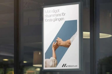
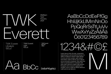
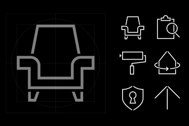
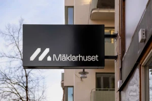
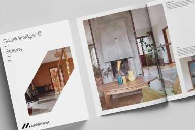
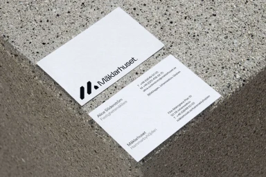
Mäklarhuset’s brand identity project establishes a cohesive visual system across their real estate platform, emphasizing professional clarity and modular design. Led by OKTO, the graphic design work leans into a minimalist aesthetic, utilizing the TWK Everett typeface and a precise geometric framework to unify physical and digital touchpoints. From exterior signage and corporate stationery to print brochures and web interfaces, the identity maintains a clean, high-contrast look. The design employs vector-based iconography and structured typography to provide a scalable, modern presence within the property sector. The project showcases how intentional typographic hierarchy and consistent graphic elements can define a corporate visual language.
Commercial, Clean, Horizontal
