
Lucy Guerin Inc: Brand Identity

Apr 2019
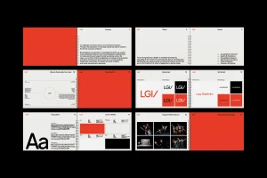
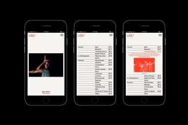
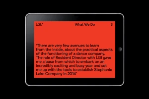
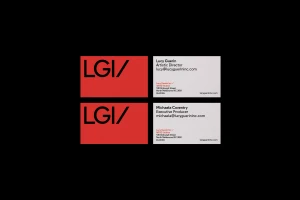
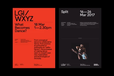
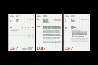
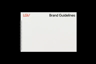
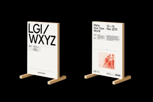
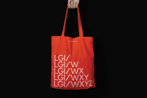
The brand identity for Lucy Guerin Inc represents a masterclass in editorial minimalism, effectively bridging the gap between high-concept contemporary dance and institutional corporate design. Developed with a keen eye for structured layout, the project establishes a cohesive visual language that leans into a vibrant color palette of bold red, neutral off-white, and deep black. This rigorous graphic design system, orchestrated by M.Giesser, utilizes a clean grid system to ensure consistency across diverse touchpoints, from digital UI illustration and mobile interfaces to physical collateral like business cards, posters, and professional documentation. By employing sharp sans-serif typography as a primary vehicle for communication, the brand identity creates an accessible yet sophisticated aesthetic that mirrors the precision of the dance company's own choreography. The work channels a modern, professional tone, utilizing high-contrast typography to emphasize clarity and movement, effectively showcasing the synergy between artistic expression and organizational structure. Whether through the minimalist application on promotional signage or the utilitarian design of internal tax invoices and guidelines, the visual strategy remains grounded in purposeful, grid-based architecture. This identity project does not merely support the brand, it defines it, providing a flexible framework that allows the movement-focused content to command attention within a highly refined and structured professional context.
Horizontal, Commercial, Clean, Minimalist
Typography
