
Next Wave: Brand Identity
Sep 2019
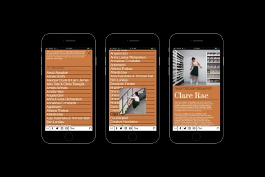
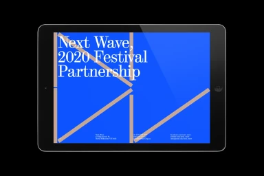
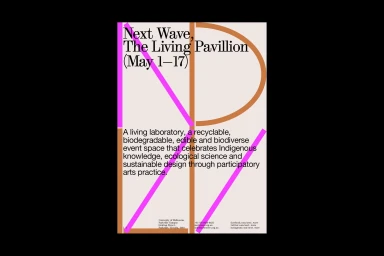
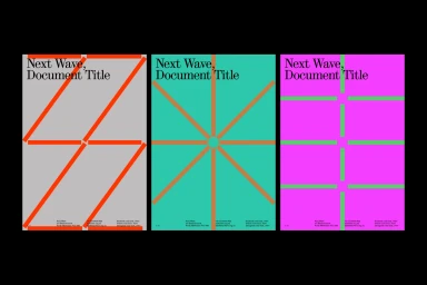
The brand identity developed for Next Wave represents a masterclass in modern graphic design, blending structural minimalism with a vibrant, high-contrast visual language. By prioritizing typography and deliberate spatial organization, the project establishes a cohesive aesthetic that spans across digital and physical touchpoints, from immersive mobile UI illustrations to large-scale event posters. M.Giesser employs a sophisticated approach to composition, utilizing bold color blocking and clean serif fonts to ground the experimental spirit of the festival brand. The work leans into editorial lifestyle influences, effectively balancing earthy, grounded tones like terracotta and beige with jarring, high-energy pops of neon pink and electric blue. Through the use of vector-based abstractions and rigid grid structures, the identity feels both timeless and distinctly contemporary. Whether it is the intuitive navigation of an artist archive or the rhythmic, geometric precision of a festival triptych, the design maintains a consistent voice that invites engagement while honoring the information-heavy requirements of cultural programming. This project demonstrates an expert command of hierarchy and negative space, transforming standard corporate communication into an artistic statement that captures the forward-thinking ethos of the Next Wave mission. The result is a versatile identity system that feels inherently premium, professional, and endlessly adaptable for diverse promotional materials, ensuring that every interaction resonates with clarity, rhythm, and structural elegance.
Graphic, Horizontal, Commercial
Motion Graphics
