
YOUTH Studio: Brand Identity

Aug 2019
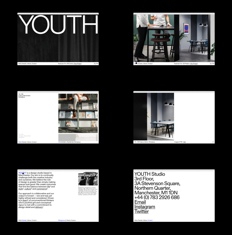
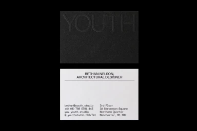
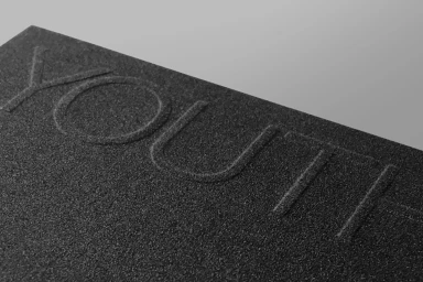
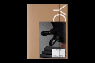
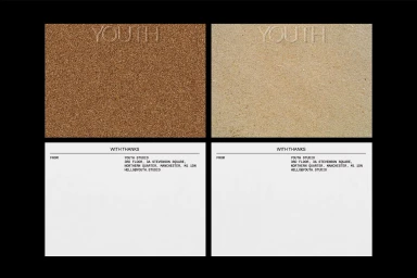
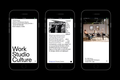
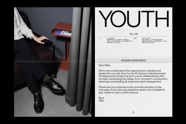
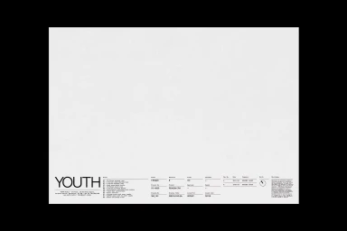
The brand identity for YOUTH Studio serves as a masterclass in editorial minimalism and corporate sophistication. Executed with a disciplined eye for structure, the project leans into a monochrome aesthetic that bridges the gap between raw, tactile materiality and digital precision. By utilizing high-contrast typography as its primary visual anchor, the design identity establishes a bold, professional presence that feels both contemporary and timeless. M.Giesser contributes a refined sensibility to the graphic design, balancing the stark, clean lines of sans-serif type with rich, textured surfaces like draped fabric, embossed cardstock, and grainy materials. This interplay creates a sophisticated depth that elevates the studio's corporate collateral, from stationery to architectural documentation. The system excels through its mastery of negative space, allowing the identity to breathe across diverse formats, including UI illustrations and professional business cards. Throughout the suite, live-action techniques and soft light help soften the stark geometry, ensuring the brand feels approachable yet rigorously organized. Based in Manchester, YOUTH Studio has cultivated a visual language that feels inherently intentional, mirroring the clarity of its architectural output. By harmonizing organic textures with functional typography, the identity functions as a cohesive ecosystem that effectively communicates the studio's commitment to precision, design integrity, and minimalist excellence in the commercial sector.
Horizontal, Clean, Minimalist
Typography
