
Arts House: Brand Identity
Jul 2018
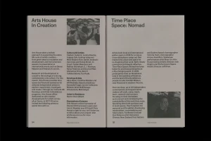
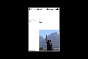
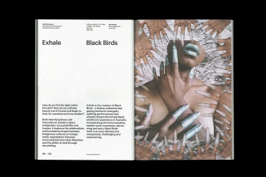
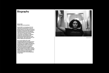
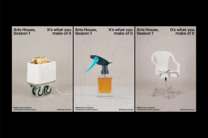
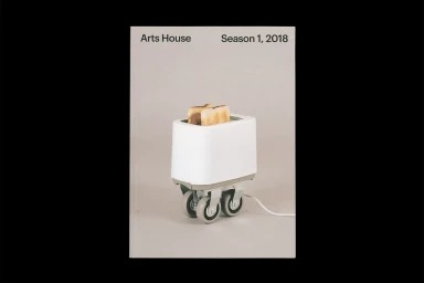
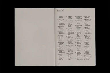
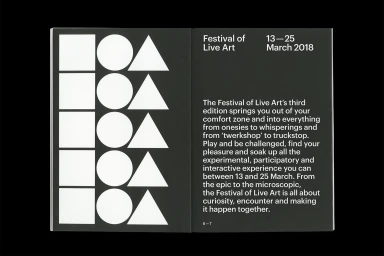
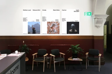
The brand identity for Arts House signals a masterclass in editorial minimalism, establishing a sophisticated visual language that navigates the intersection of digital media and contemporary arts. Designed by M.Giesser, the identity leans into a stark, high-contrast aesthetic that favors clarity, legibility, and structural precision. Across a suite of media, including event posters, editorial layouts, and high-end publications, the work utilizes a clean, sans-serif typography that grounds the project in a professional, corporate sensibility. This foundation is cleverly disrupted by surrealist elements, such as metallic collages and whimsical, modified household objects, which infuse the brand with a distinct artistic personality. The execution frequently employs analogue film textures and low-key chiaroscuro lighting to elevate standard corporate collateral into a curated, gallery-worthy experience. By leveraging effective negative space and a disciplined, grid-based alignment, the identity achieves a balance between the utilitarian demands of event programming and the expressive nature of the arts. Each element, from the triptych of reconfigured domestic goods to the information-heavy festival posters, reinforces a cohesive narrative. The result is a refined brand identity that speaks with authority, utilizing a neutral palette to ensure the content remains the focal point while maintaining a design language that feels both timeless and deeply embedded in current industry trends for experimental and participatory media.
Horizontal, Clean, Minimalist
Typography
Editorial
