
LO.W: Brand Identity
Sep 2020
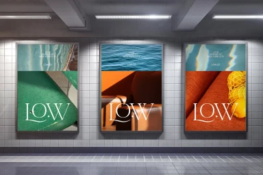
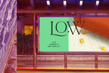
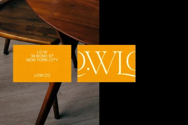
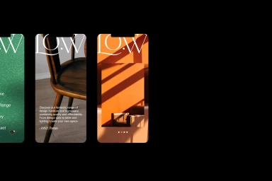
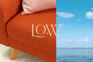
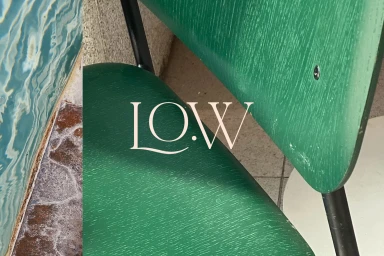
The brand identity project for LO.W effectively bridges the gap between organic domestic warmth and sharp, contemporary minimalism, resulting in a cohesive visual language that feels both approachable and high-end. Through a sophisticated commercial design strategy, the project utilizes an inventive split-screen layout that pairs intimate, textured interior homeware photography with expansive natural vistas. The design team at An Open Understanding masterfully anchors these disparate elements—ranging from rich mahogany furniture and orange-netted surfaces to serene, cloud-dappled horizons—using a refined, elegant serif typography that serves as the brand's primary signature. This corporate identity leans into a structured, professional aesthetic while incorporating whimsical touches, such as pops of yellow spheres or diagonal sunlit shadows, to break the rigidity of the grid. The application across diverse touchpoints, from urban subway and bus stop posters to mobile screen layouts, highlights the versatility of the brand's design system. By leveraging typography as a bridge between the physical and the abstract, the execution achieves a balanced, modern tension. The project feels grounded in a specific, clean-lined urban reality while maintaining a flexible, high-contrast visual identity that speaks to a sophisticated demographic. Through meticulous attention to material texture and composition, the work avoids the typical traps of corporate minimalism, instead offering a tactile, evocative experience that elevates the brand as a leader in refined interior lifestyle design.
Horizontal, Commercial, Graphic
Typography
