
Picfair: Brand Identity




Brand
Date
Oct 2022
Description
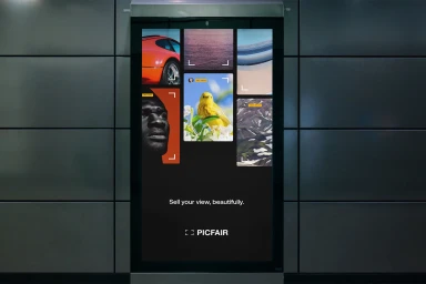
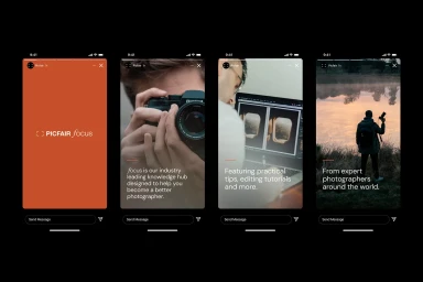
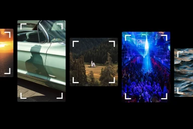
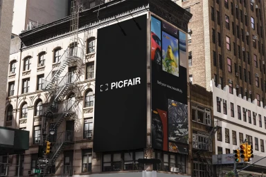
Picfair, a digital platform for photographers, features a refreshed brand identity developed by An Open Understanding and Visie Admin. The visual system centres on a minimalist aesthetic, utilizing high-contrast typography, bold orange accents, and precise vector elements that reinforce the platform's core focus on photographic curation. The identity employs clean, modern UI design, integrating viewfinder corner markers and crop marks across both outdoor advertising and digital interfaces. By incorporating consistent graphic clarity, the project establishes a cohesive look that spans web layouts and large-format commercial displays.
Style
Commercial, Clean, Horizontal
Techniques
Typography
Industries
Color
Pure White
Associated creatives

5000+ creatives to discover
Sign up to gain access to the entire directory. It’s free.
Visie is a curated library of creative professionals.