
Brand
ProjectBrand Identity
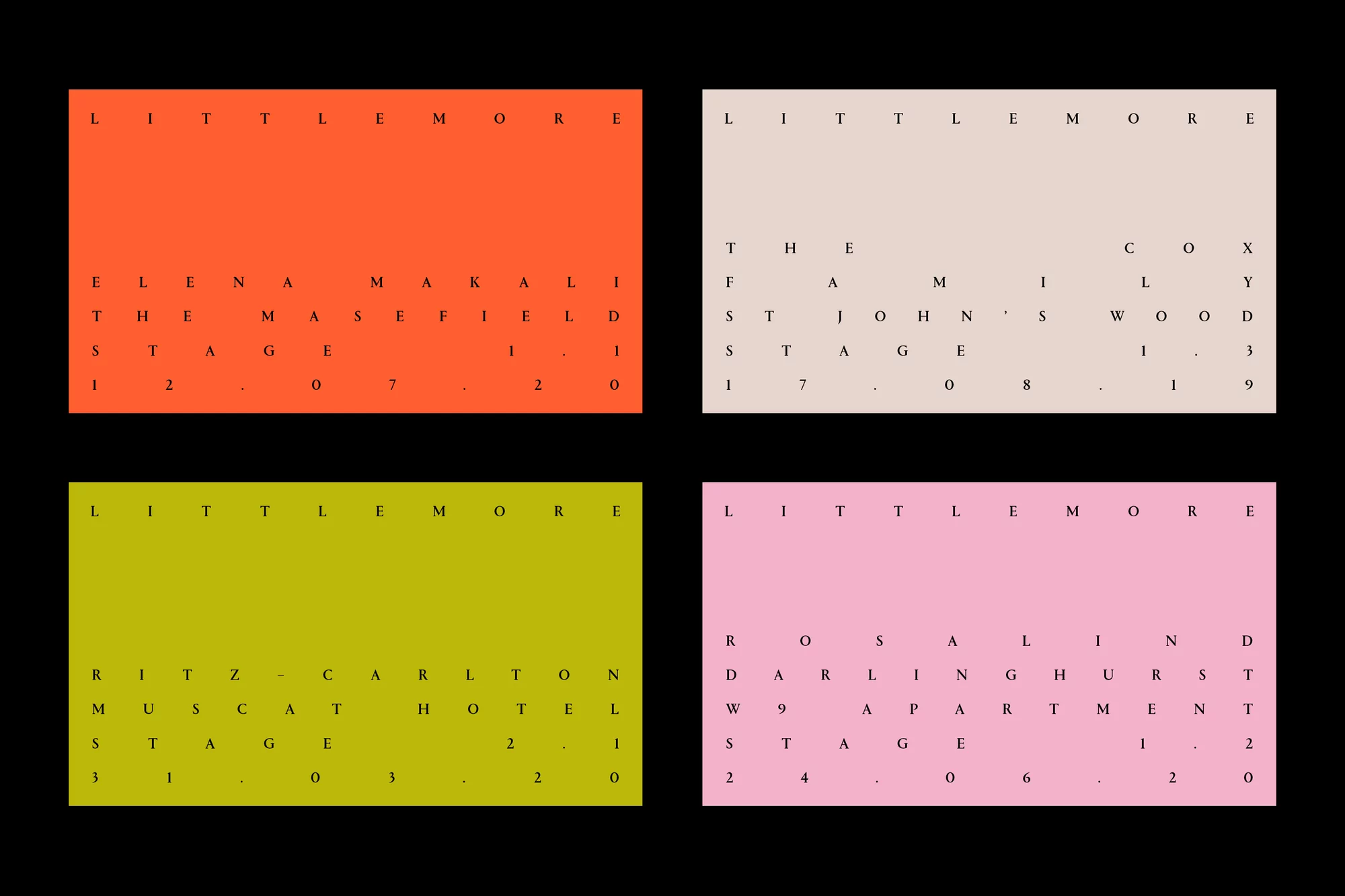
Littlemore Brand Identity 2021
Associated creatives

Tags
Description
This image showcases a brand identity project for Littlemore featuring four distinct rectangular cards set against a black background. Each card displays a solid color field in vibrant orange, pale beige, olive green, or soft pink, accompanied by sparse, widely spaced uppercase typography arranged in a clean grid. The layout emphasizes letterspacing and minimalist design principles across each color variant. The project was designed by DutchScot, focusing on clean typographic presentation.