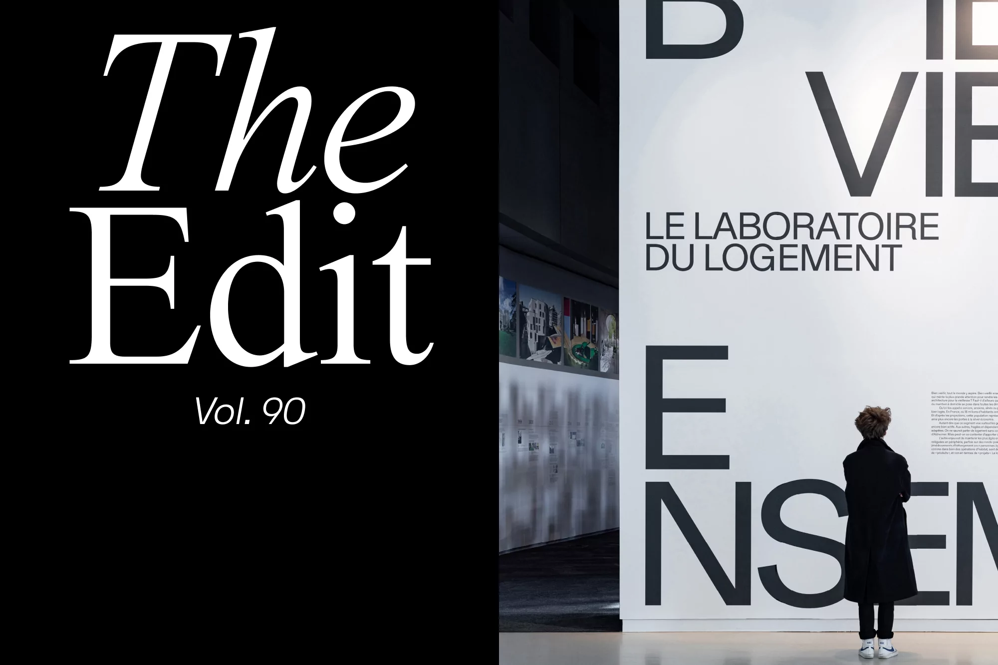
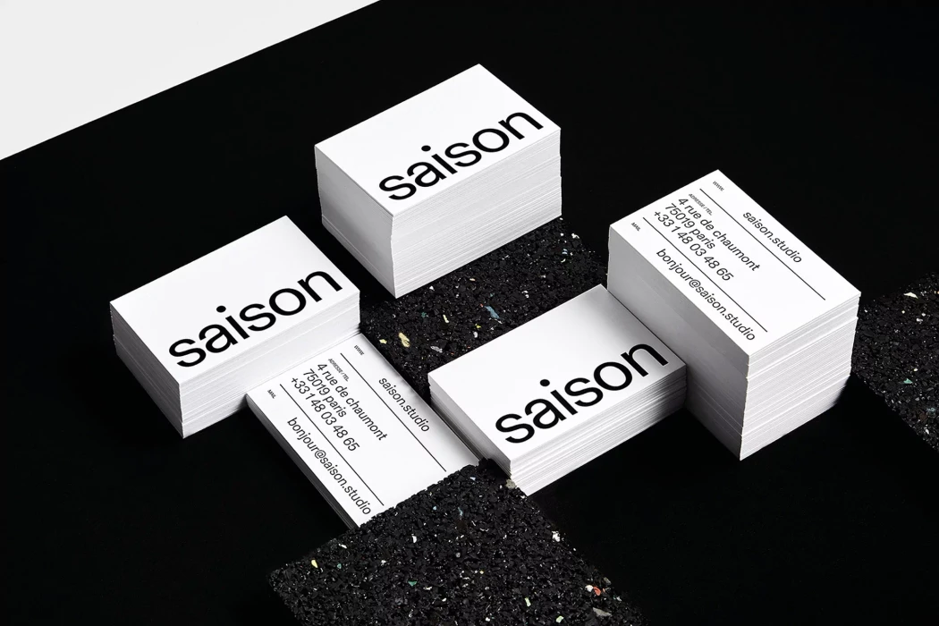
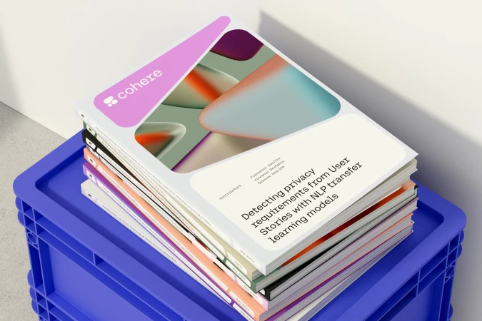
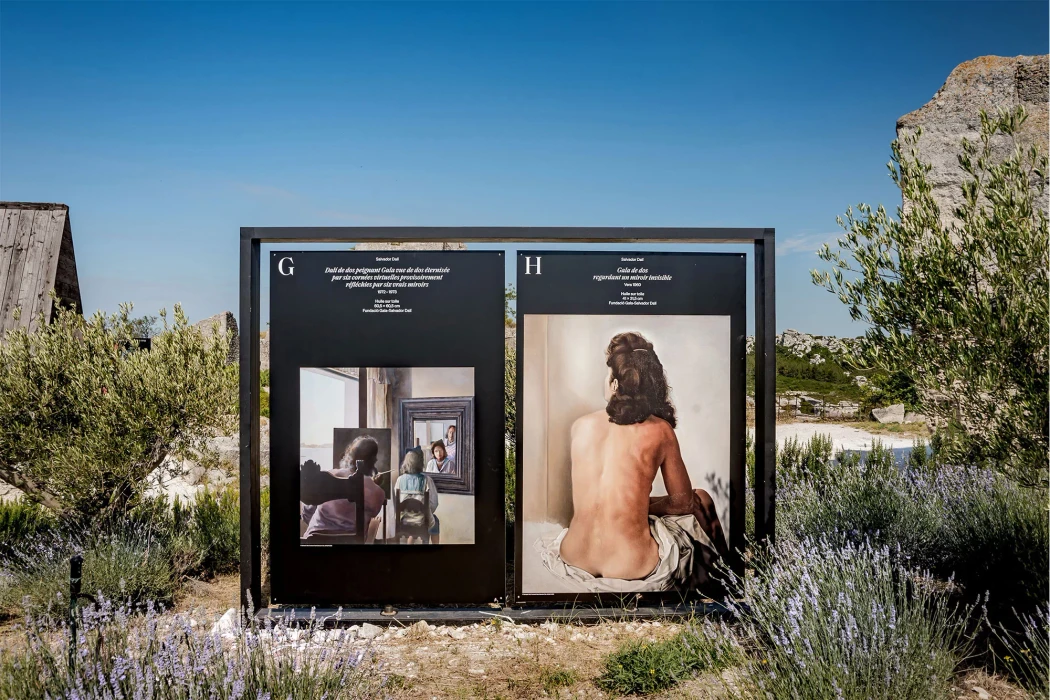
The brand identity for Bien Vieillir Ensemble establishes a visual language that seamlessly bridges architectural precision with modern lifestyle branding. Executed by République Studio, Skeleton Crew, Frans Hulet, Melina Papadioti, and Ivana Palecková, the project leans into editorial minimalism to create a cohesive aesthetic that spans corporate communications, retail packaging, and large-scale environmental design. The work is anchored by a sharp, high-contrast typography system that commands attention whether it is featured on expansive exhibition walls or printed across detailed information brochures. By utilizing a clean, modular grid, the identity effectively organizes complex project data while maintaining a refined, artistic sensibility. The visual execution utilizes cinematic lighting and natural light to emphasize the textures of both the materials and the environment, ensuring that the brand feels grounded yet forward-thinking. From the careful staging of skincare products on concrete surfaces to the bold application of sans-serif lettering in public transit outdoor advertising, the identity demonstrates a versatile range. The project succeeds by prioritizing structured information design and architectural clarity, resulting in a cohesive experience that feels intentional and sophisticated across every touchpoint. This is a study in restrained branding where the intentional use of negative space and crisp photography elevates the overall narrative, creating a distinctive presence for the brand within a competitive and design-conscious marketplace.