
Brick Magazine
Brand Identity
Sep 2017
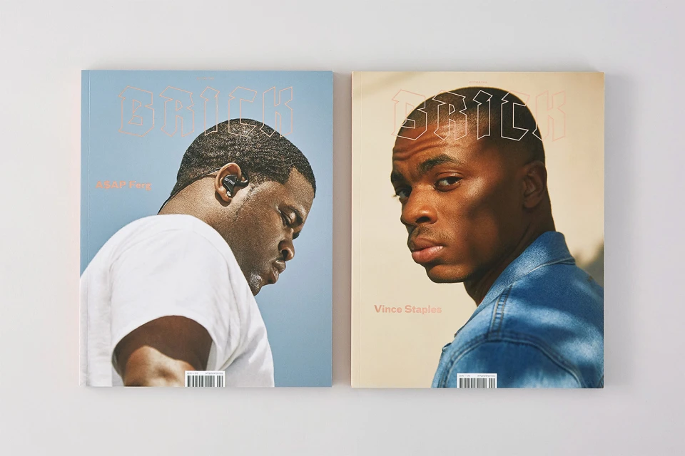
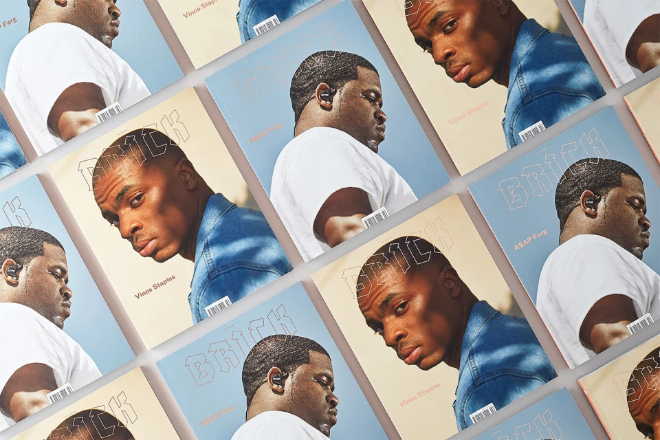
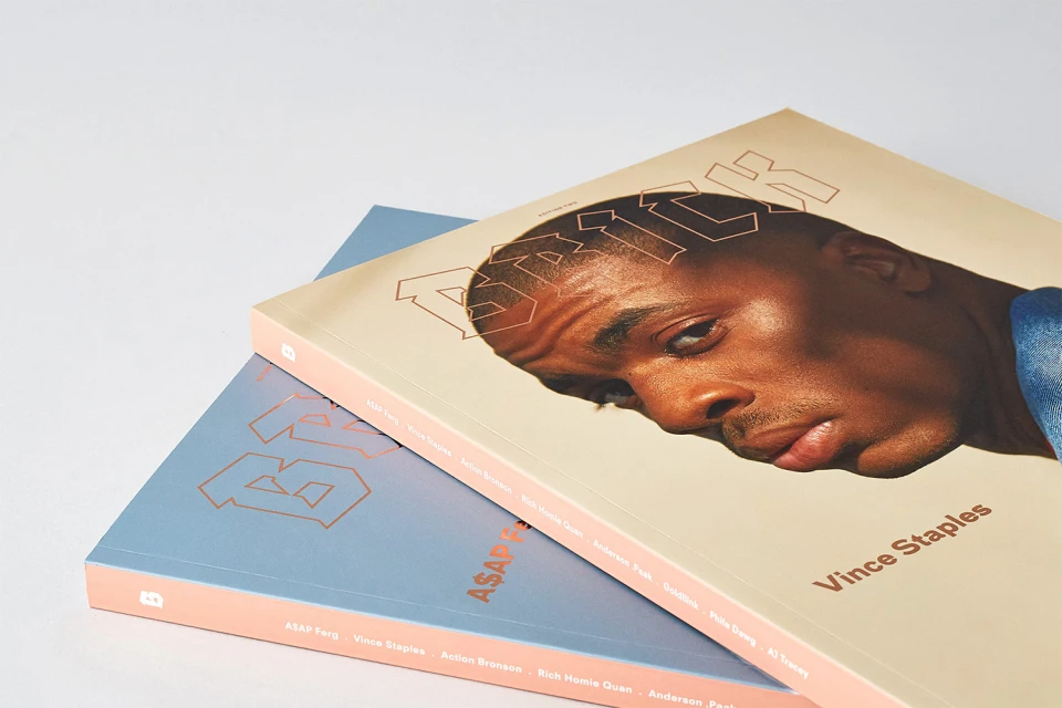
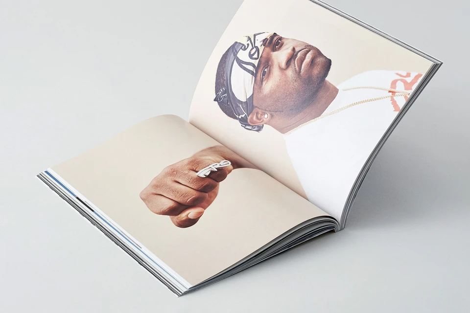
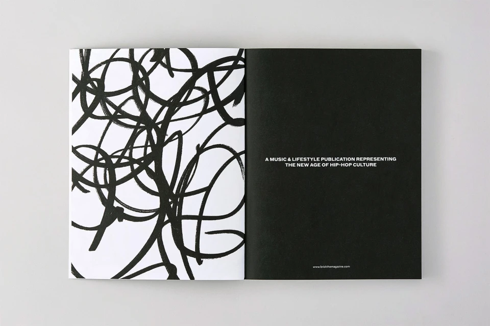
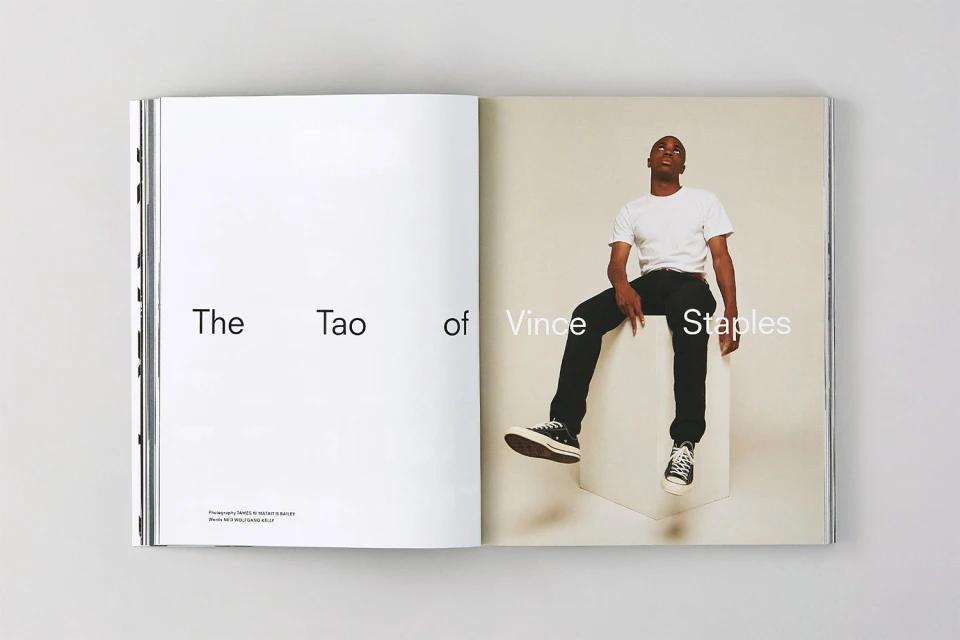
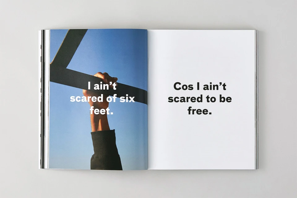
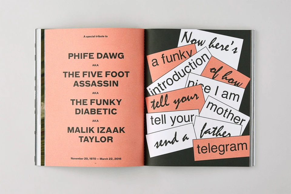
Brick Magazine’s recent brand identity refresh serves as a masterclass in editorial minimalism, effectively bridging the gap between high-fidelity music journalism and avant-garde print design. By distilling the complex energy of contemporary hip-hop culture into a highly disciplined visual language, the publication establishes a distinct presence within the crowded magazines, media and entertainment sector. The project leans into a sophisticated aesthetic, utilizing high-key studio strobe lighting and stark negative space to ensure that featured portrait subjects like A$AP Ferg and Vince Staples remain the absolute focal point. Throughout the editorial spreads, the design prioritizes a rhythm of contrast; thin, geometric outline typography is juxtaposed against chaotic, ink-based abstract patterns, while bold sans-serif headlines anchor the minimalist page layouts. With graphic design handled by POST, the brand identity relies on a clean, rhythmic visual flow that makes the printed object feel like a gallery-grade collectible. The work successfully navigates the tension between commercial accessibility and artistic integrity, employing techniques like expressive collage and precise typographic placement to capture the soul of the culture. Ultimately, this comprehensive design system elevates the magazine beyond a simple trade publication, transforming each issue into a curated experience that balances structured, modern sensibility with the raw, rhythmic spirit of the artists it represents.
Editorial, Horizontal, Clean, Minimalist
Typography
Magazines
White Seamless
Editorial
