
FARE
Brand Identity
Jan 2018
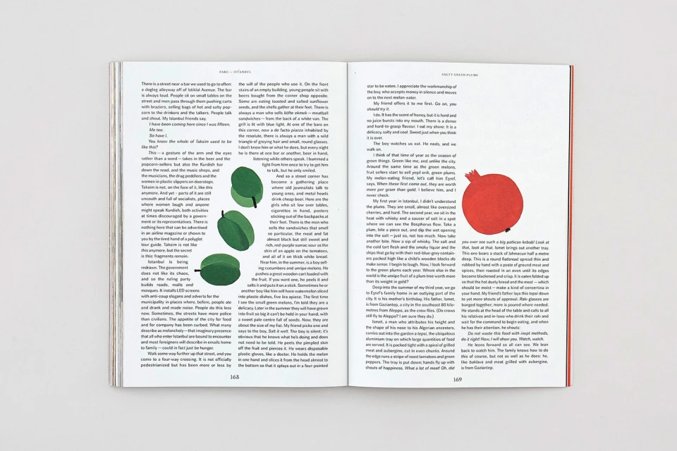
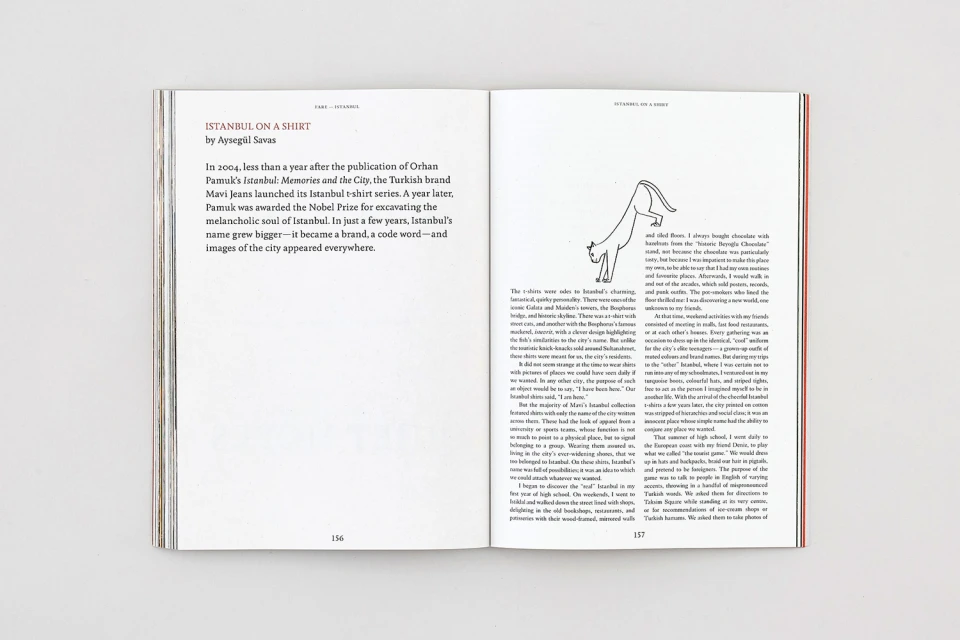
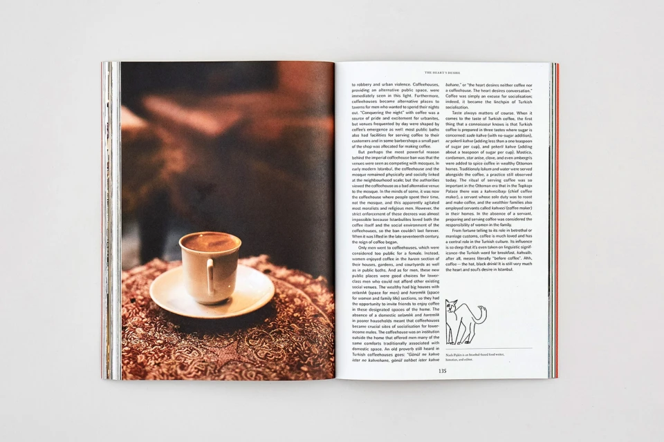
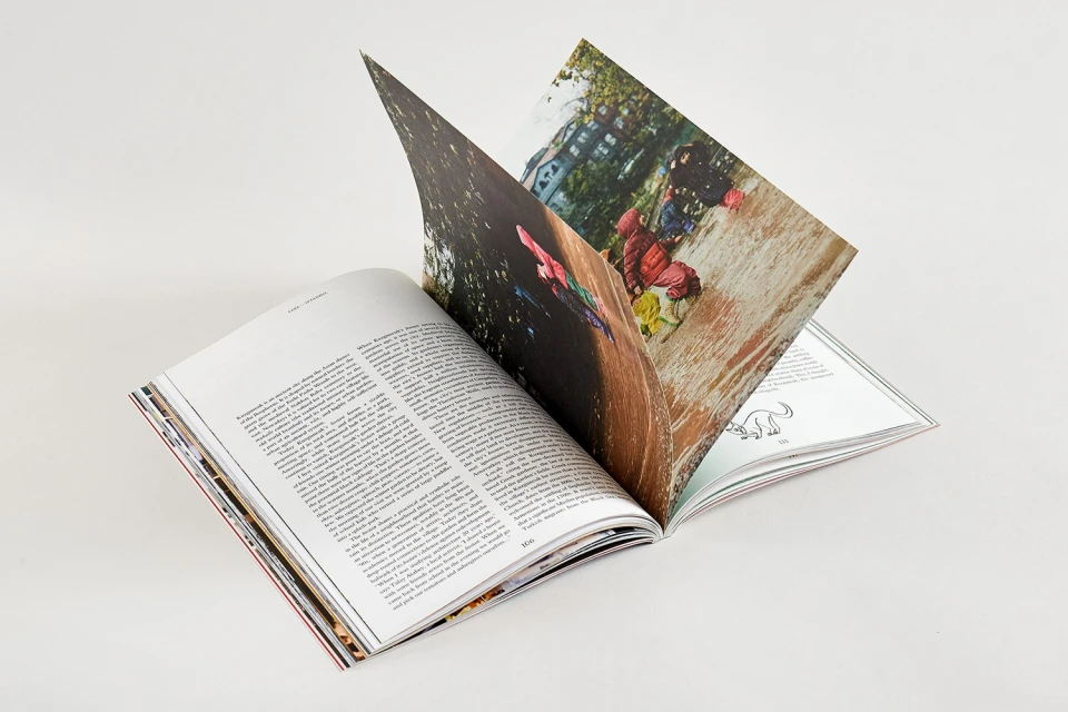
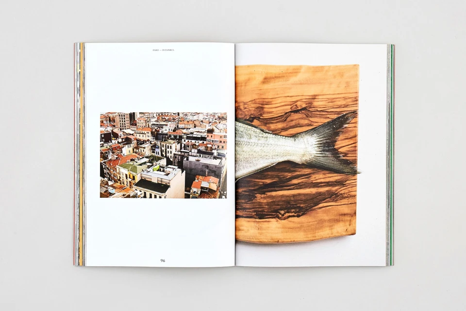
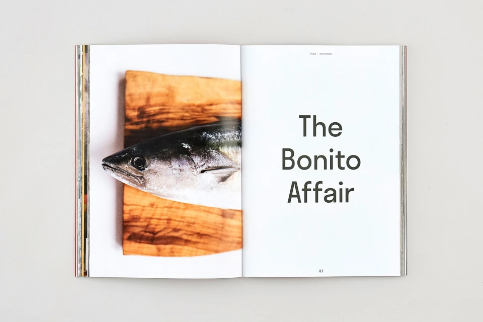
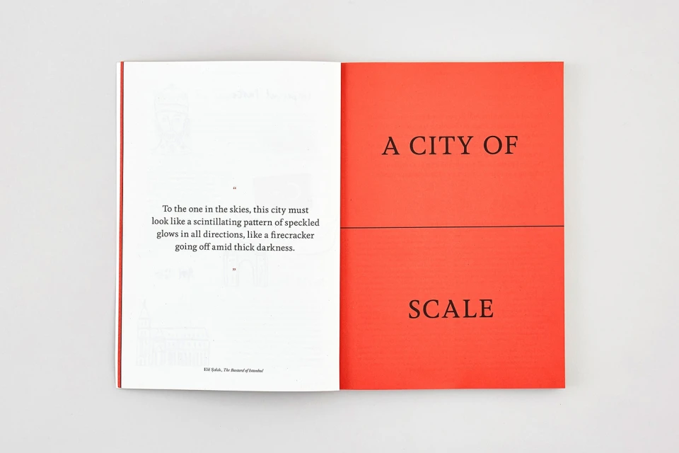
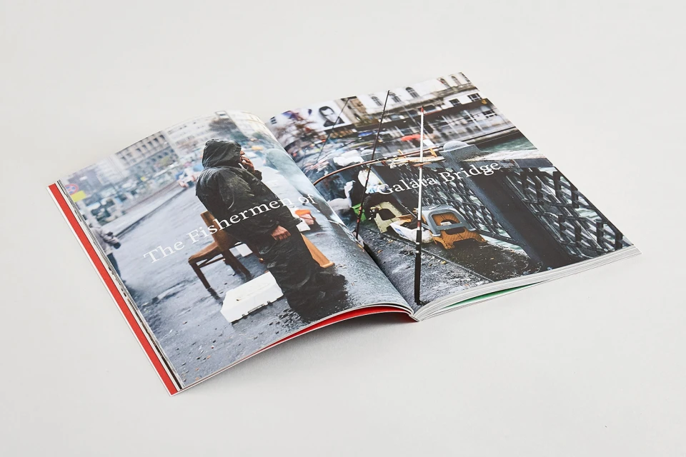
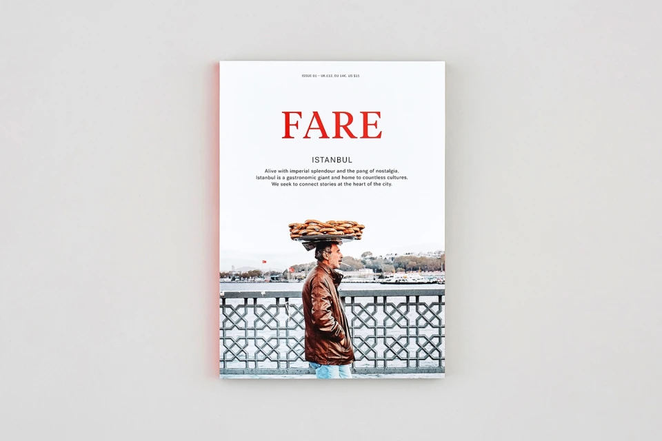
The brand identity for FARE magazine serves as a masterclass in editorial design, demonstrating how sophisticated typography and deliberate negative space can elevate narrative-driven media. Spearheaded by the team at POST, the visual identity leans into a clean, minimalist aesthetic that allows the publication to act as a bridge between high-end culinary documentation and deep-dive cultural storytelling. Across various spreads, the layout relies on a refined serif typeface that establishes a clear hierarchy, expertly balancing dense, informative columns with evocative lifestyle photography. The project effectively utilizes a mixture of natural light and cinematic techniques to bring its subjects to life, whether capturing the textured grain of a wooden cutting board in a food spread or the architectural silhouettes of an urban cityscape. By integrating simple, flat-style vector illustrations with high-quality print imagery, the design maintains a cohesive visual language that feels both timeless and modern. The result is a publication that prioritizes clarity and intentionality, ensuring that every page turn contributes to a broader, immersive experience for the reader. Through its masterful application of editorial standards, FARE establishes a distinct, elevated presence within the magazines and media landscape, proving that thoughtful graphic choices are essential to communicating the cultural nuance of a city and the heritage of its culinary traditions.
Editorial, Horizontal, Clean, Minimalist
Typography
White Seamless
Editorial
