
FARE
Brand Identity
Jun 2019
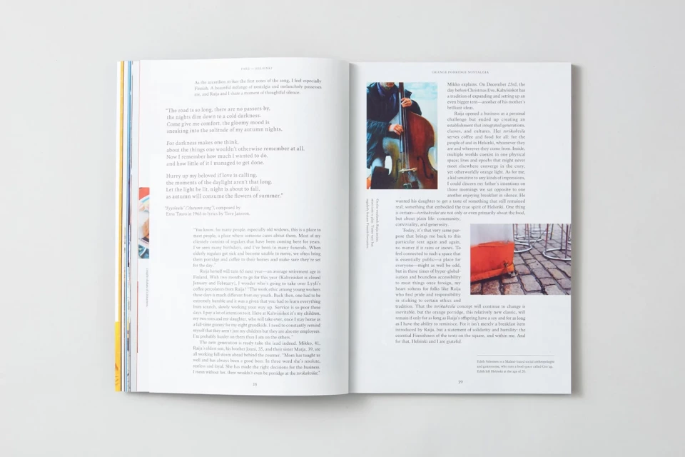
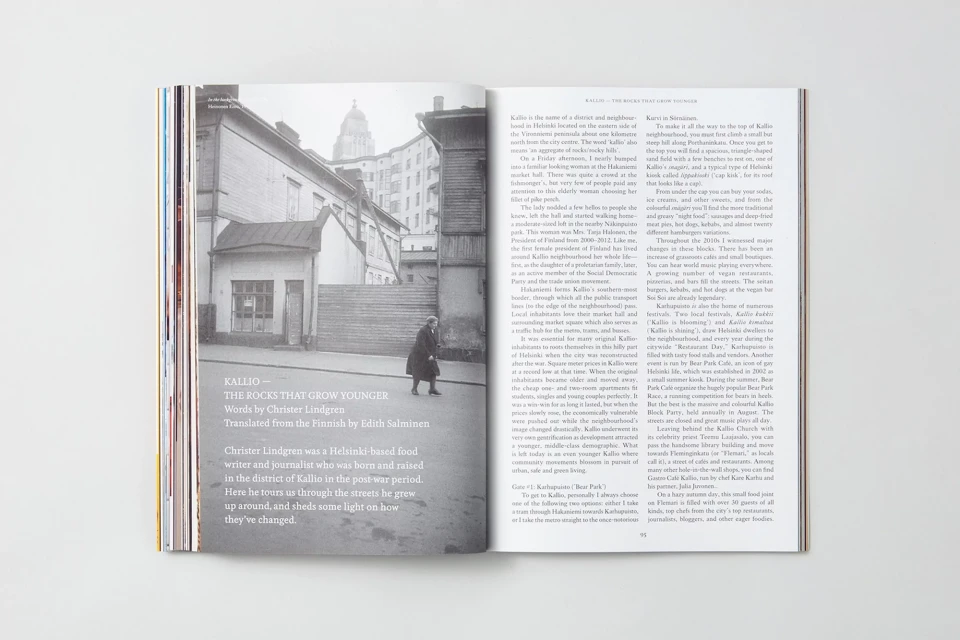
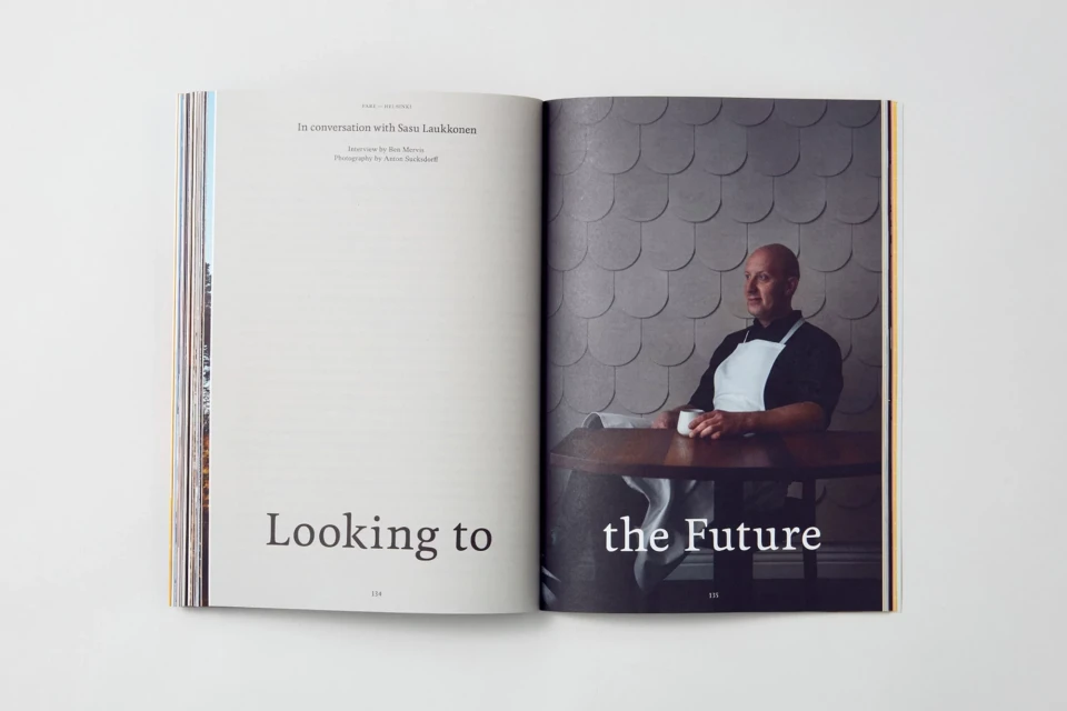
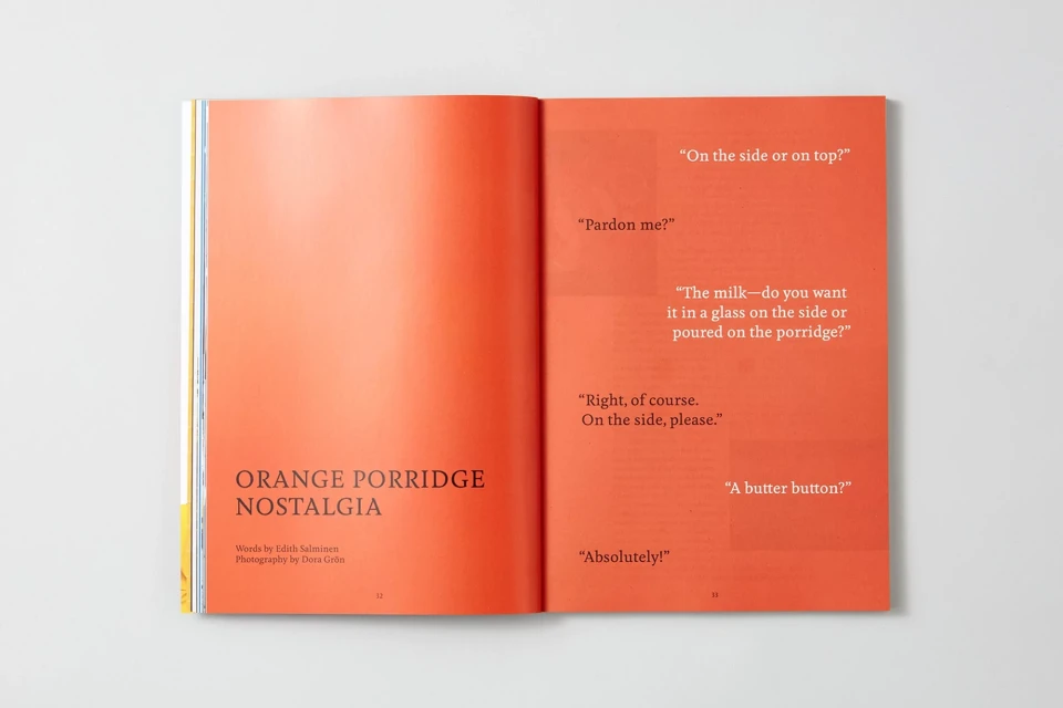
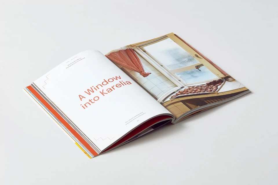
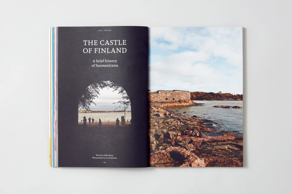
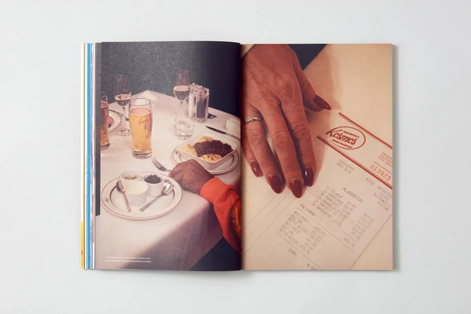
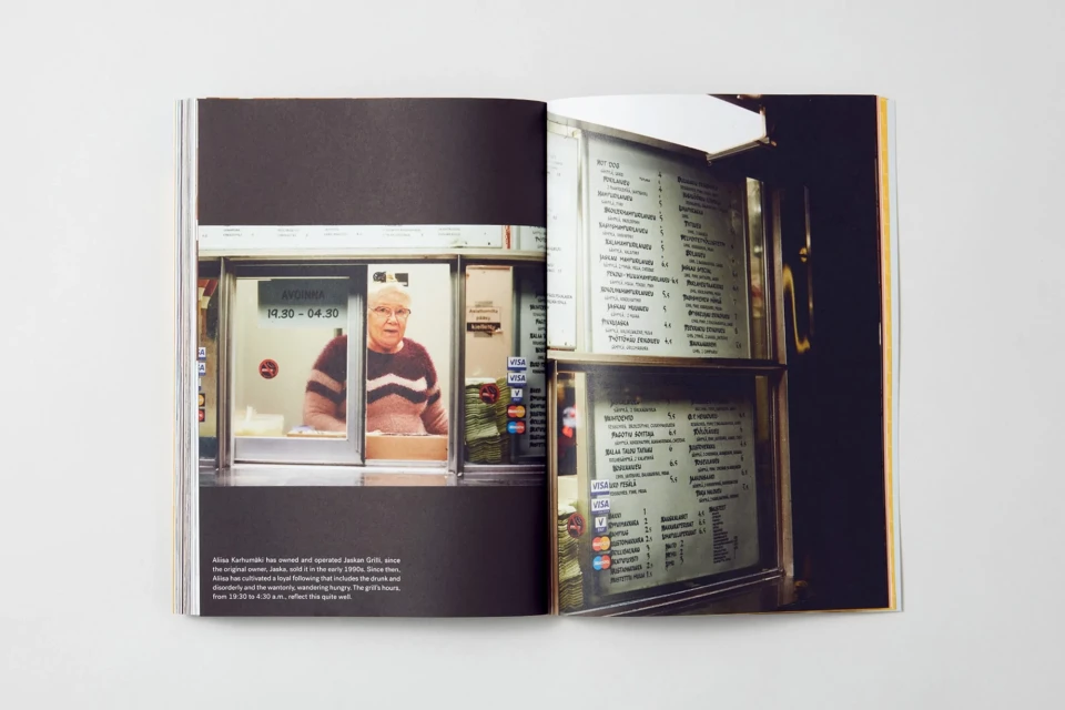
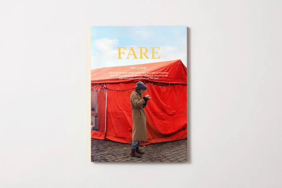
The brand identity for FARE serves as a masterclass in editorial design, positioning the publication as a sophisticated intersection of digital media and print culture. By prioritizing a clean, minimalist aesthetic, the project leverages ample negative space and refined typography to elevate its storytelling. Each spread is meticulously crafted to balance dense, journalistic body copy with high-impact photography, creating a cohesive visual language that feels both classic and contemporary. The design by POST leans into an editorial sensibility that favors understated elegance over clutter, utilizing intentional monochromatic color blocks—most notably a recurring vibrant orange—to anchor the reader’s eye. Whether documenting the quiet architecture of an urban street scene or the tactile intimacy of a dining table, the layout employs natural light to enhance the narrative quality of the imagery. This live-action technique creates a sense of presence, grounding the reader in the specific environment of the feature. From the textural nuance of a portrait framed in a food kiosk window to the expansive composition of a coastal fortress in Finland, the publication emphasizes the tactile, physical quality of its matte paper finish. The result is a publication that functions not merely as a carrier of information, but as a deliberate, immersive object, showcasing how thoughtful composition can define the voice of a modern media entity.
Editorial, Horizontal, Clean
Typography
White Seamless
Editorial
