
Evermore London: Brand Identity


Jun 2019
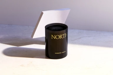
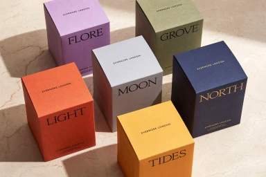
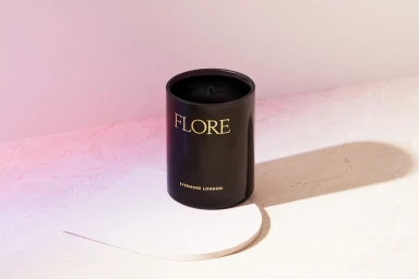
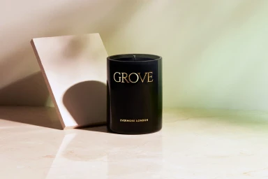
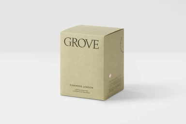
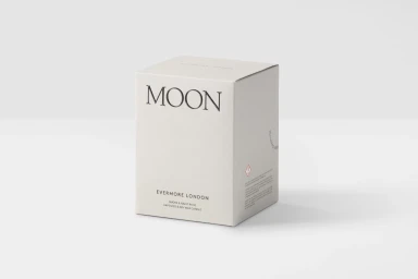
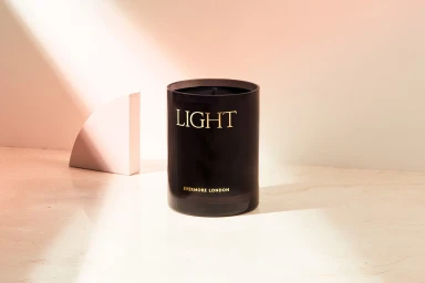
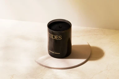
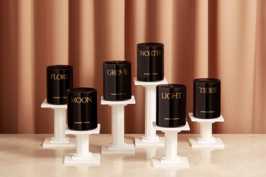
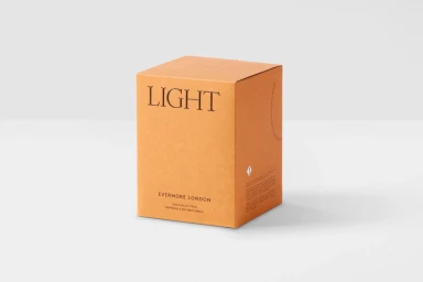
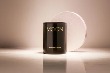
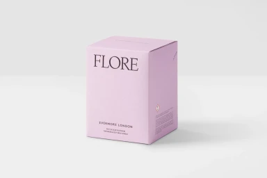
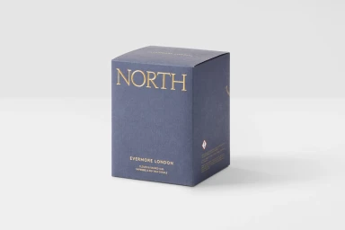
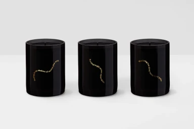
Evermore London commands attention through a refined approach to product design and brand identity, establishing a visual language that balances luxury with understated minimalism. This project highlights the label's home fragrance collection, translating a sensory experience into a highly curated aesthetic that leans into geometric precision and refined material textures. Through a series of high-end commercial photographs, the brand is presented against veined marble surfaces, soft pleated textiles, and seamless backdrops, allowing the architectural forms of the cylindrical glass vessels and matte-finished boxes to take center stage. The execution makes masterful use of soft, directional light and high-contrast shadow play to emphasize the tactile quality of the packaging, from the gold-foil embossed typography to the subtle grains of the textured cardstock. Beyond individual packshots, the composition incorporates thoughtful, still-life styling—pairing the candles with ceramic objects and botanical elements—to ground the brand in a sophisticated, aspirational lifestyle context. With creative oversight from the team at POST, the identity feels both timeless and contemporary, relying on balanced negative space and a restrained color palette to convey premium quality. The result is a cohesive, polished visual narrative that elevates the brand, proving that true luxury resides in the quiet harmony of form, material, and light.
Horizontal, Commercial, Clean, Minimalist
E-commerce / Product
