
Junction House: Brand Identity
Dec 2018
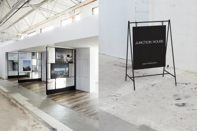
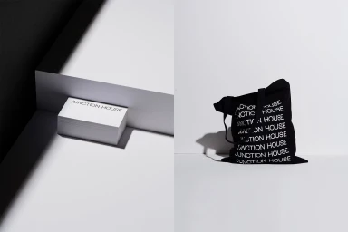
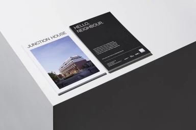
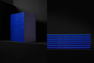
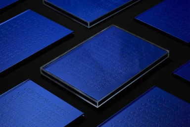
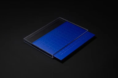
The new brand identity for Junction House serves as a masterclass in architectural minimalism, effectively bridging the gap between raw industrial character and sophisticated corporate communication. Led by the design team at Vanderbrand, the identity system leans into a high-contrast aesthetic that prioritizes geometric precision and tactical materiality. Across a suite of collateral—ranging from marketing brochures that invite local engagement to tactile, embossed promotional objects—the project consistently utilizes a stark monochrome palette punctuated by a bold, vibrant blue. The application of typography is central to this visual narrative, with a clean, sans-serif font deployed in both expansive, negative-space layouts and dense, repetitive patterns. The integration of cinematic lighting and chiaroscuro techniques transforms standard corporate materials into sculptural, high-impact pieces that feel as much at home in a gallery as they do on a desktop. By balancing soft light with sharp, architectural lines, the identity creates an immersive, cohesive experience that mirrors the converted industrial spaces it represents. Whether through the crisp layering of acrylic sleeves or the deliberate arrangement of grid-based signage, the work demonstrates a refined commitment to clarity and form. This project successfully establishes Junction House as a premium, modern entity, utilizing strategic material contrast and elevated graphic design to define a distinct and memorable brand presence within the commercial landscape.
Horizontal, Commercial, Clean, Minimalist
Typography
Black Seamless
Advertising Campaign
