
Sapsucker: Brand Identity

Nov 2019
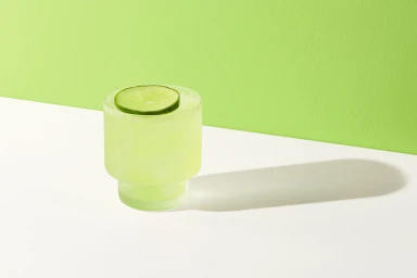
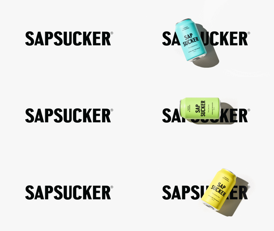
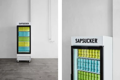
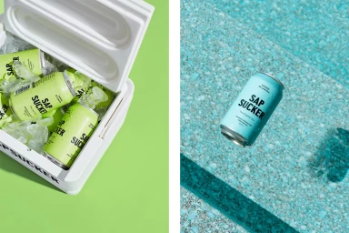
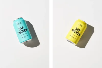
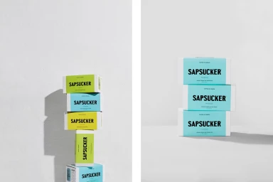
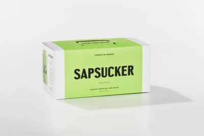
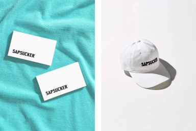
The brand identity for Sapsucker, the Canadian producer of organic sparkling tree water, functions as a masterclass in modern CPG design. Through a deliberate exercise in editorial minimalism, the project elevates the brand’s visual language, leaning heavily into a high-key aesthetic that prioritizes clarity, vibrancy, and a sharp, graphic sensibility. With design leadership from the team at Vanderbrand, the identity system successfully bridges the gap between functional product marketing and a lifestyle-forward visual ethos. The imagery utilizes soft light to render the sparkling beverages in a way that feels simultaneously refreshing and aspirational, favoring clean, color-blocked backgrounds that allow the bold sans-serif typography to anchor the composition. By incorporating versatile elements—ranging from precise, professional product photography and vector-based brand assets to lifestyle-integrated merchandise—the identity maintains consistency across diverse consumer touchpoints. The use of hard light in specific product shots adds architectural tension to the minimalist framing, emphasizing the geometric forms of the packaging. Whether through the crisp presentation of the aluminum cans or the tactile, branded soft goods, the project creates a cohesive world for the brand that feels both approachable and premium. The result is a highly polished commercial campaign that speaks to the clarity of the product, ensuring that the brand’s vibrant, natural credentials remain front and center in a crowded beverage market.
Horizontal, Commercial, Clean, Minimalist
Natural light
White Seamless
E-commerce / Product
