
Oxford Properties: Brand Identity



Aug 2020
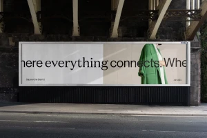
Oxford Properties elevates the narrative of urban development through a meticulous and cohesive brand identity that transforms the Square One District into a destination of connection. Designed with a sophisticated graphic design sensibility by Vanderbrand, the project moves beyond traditional real estate marketing to establish a lifestyle-oriented identity. The execution leans into editorial minimalism, utilizing a high-contrast palette of crisp whites, soft purples, and deep blacks to create a balanced, grid-based visual language. By seamlessly integrating architectural rendering and clean typography, the campaign establishes a professional yet accessible tone that anchors the development as a visionary mixed-use community. The collateral captures this modern ethos through diverse touchpoints, from large-scale outdoor billboard advertisements placed in urban environments to tactile brand identity brochures that emphasize the human experience of space. A standout element is the use of high-fidelity 3d render / cgi techniques, which provide a sterile, high-end feel that complements the more organic live-action technique utilized in lifestyle photography. Through strategic ui illustration and bold, modern sans-serif typography, the project successfully reconciles the scale of a corporate entity like Oxford Properties with the local, human-centric focus of a neighborhood hub. The final result is a clean, corporate visual system that prioritizes clarity, whitespace, and a sense of belonging, effectively positioning the brand as a key player in the evolution of modern real estate platforms.
Clean, Minimalist, Horizontal
Typography
