
Junction: Brand Identity


Sep 2023
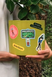
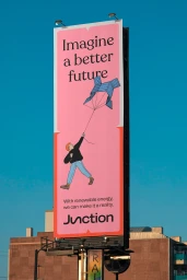
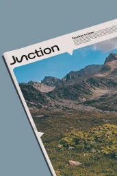
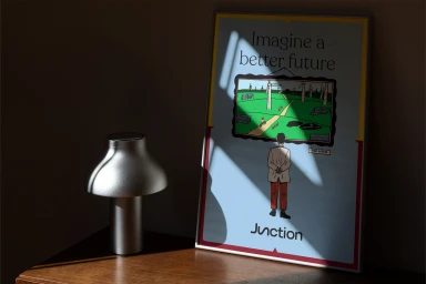
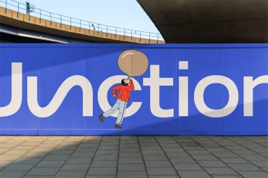
Junction’s brand identity project, developed by Sons & Daughters ID with illustration by Kornelija Zalpyte, establishes a visual language centered on renewable energy and sustainable growth. The design system utilizes a palette of clean, vibrant colour blocking and precise typography to translate complex corporate messaging into accessible visual storytelling. The project incorporates a mix of vector-based illustrative graphics and motion design to highlight key themes of transition and future-focused development. By integrating these elements across print media, environmental displays, and digital animations, the identity maintains a consistent graphic aesthetic. Key techniques including minimalist layout design and hard light photography frame the brand as both professional and forward-thinking.
Commercial, Clean, Horizontal

