
Artery: Brand Identity

Sep 2021
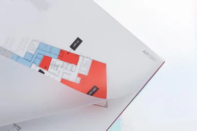
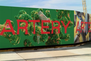
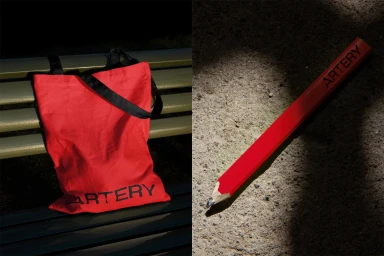
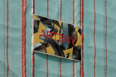
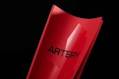
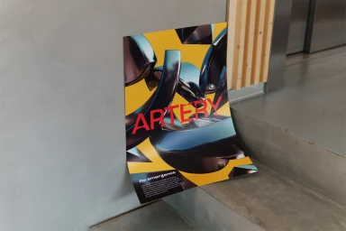
The Artery brand identity project establishes a visual language centered on high-contrast typography and layered structural elements. Developed by Sons & Daughters ID with 3D work by Mindaugas Dudenas, the system utilizes a bold palette of red, yellow, and deep green to anchor its graphic applications. The project manifests across diverse media, from architectural floor plans and construction hoardings to product mockups and printed collateral. The aesthetic leans into minimalist design principles, integrating 3D render / CGI techniques to create depth against textured backdrops like concrete and industrial mesh. The execution emphasizes clean lines and intentional, dramatic lighting to maintain a consistent corporate identity across both static and dimensional assets.
Horizontal, Commercial, Clean
3D render / CGI

