
Digerolamo: Brand Identity


Jul 2021
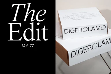
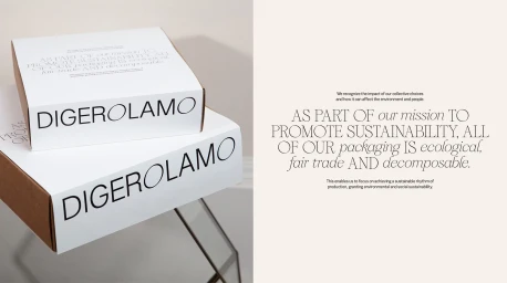
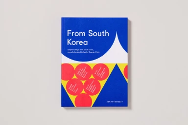
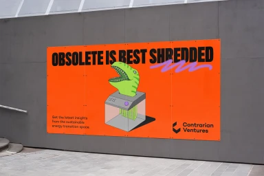
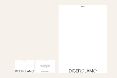
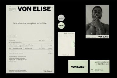
Digerolamo’s brand identity project centers on a refined editorial aesthetic, utilizing a disciplined approach to typography and minimalist graphic design. The system incorporates a diverse suite of stationery, packaging, and digital collateral that prioritizes structured spacing and high-contrast layouts. Key design elements include the integration of serif and sans-serif typefaces across both print and UI illustrations. Sustainable packaging and tactile paper finishes are emphasized through a monochromatic and neutral color palette, occasionally punctuated by primary colors and geometric motifs to maintain visual impact. This body of work was developed through the collaborative efforts of VEDIA DESIGN, Antton Ugarte, Margot Lévêque, Counter-Print, Sons & Daughters ID, and Studio Furore, reflecting a cohesive approach to commercial branding.
Horizontal, Commercial, Clean, Minimalist


