
Isokon Furniture Company
Brand Identity
Mar 2018
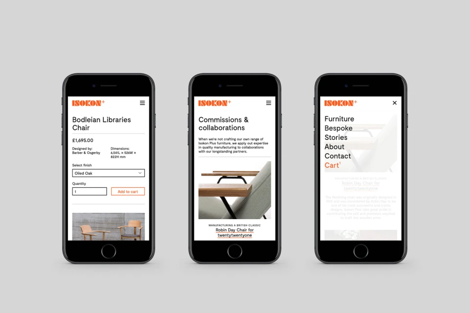
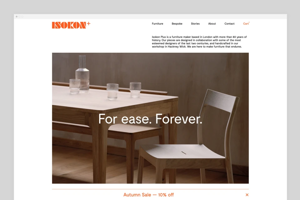
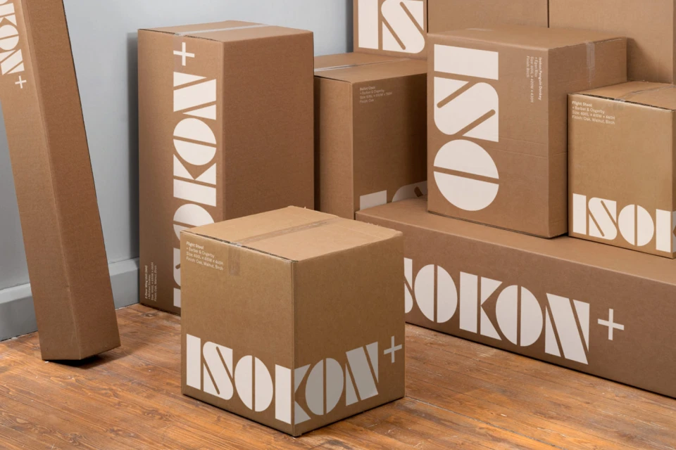
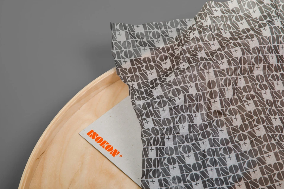
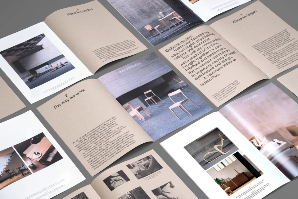
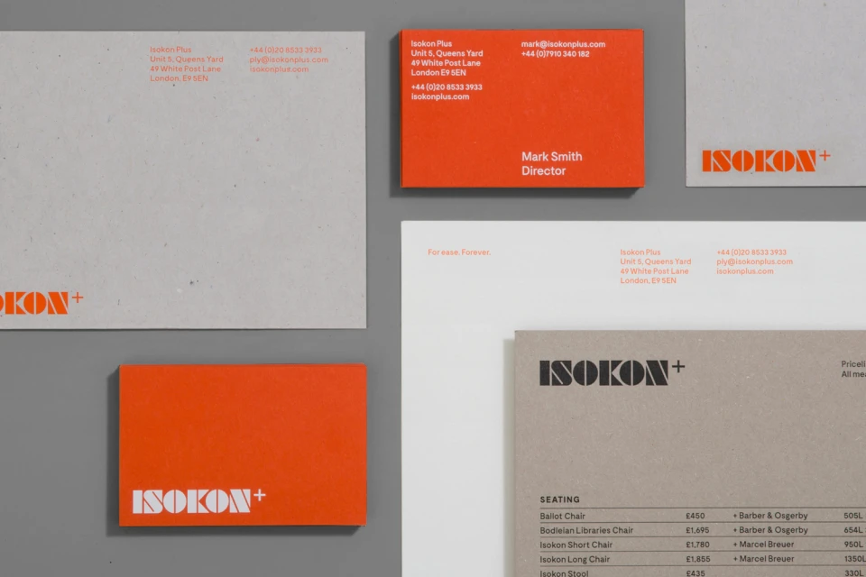
For Isokon Furniture Company, the refreshed brand identity developed by DNCO signals a sophisticated evolution within the specialty retailers and retail landscape. By anchoring the visual language in functional modernism, the project achieves a seamless bridge between heritage craftsmanship and contemporary digital expectations. The design system leans into editorial minimalism, utilizing a restrained, neutral color palette punctuated by a bold, signature orange that breathes life into their stationery, packaging, and digital interfaces. This UI illustration and typography-focused identity prioritizes clarity and whitespace, allowing the inherent tactile, organic texture of the iconic plywood designs to remain the primary focus. Across the various touchpoints, from the high-fidelity web interface—which captures the brand ethos of For ease. Forever.—to the studio-captured product collateral, the work feels meticulously organized. The packaging design further reinforces this commitment to materiality, as semi-transparent tissue paper and matte cardboard textures ground the graphic elements in a tactile, high-end experience. Through the use of grid-based layouts and clean sans-serif typefaces, the branding communicates a structured, architectural perspective that resonates with modern design enthusiasts. Every element, from the hero banners to the multi-page editorial brochures, reflects a deep understanding of how to translate a legacy of craftsmanship into a cohesive, modern graphic design system that feels both timeless and exceptionally polished.
Horizontal, Commercial, Clean
