
Museum of the Home: Brand Identity


Dec 2019
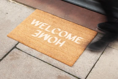
The brand identity for the Museum of the Home stands as a masterclass in modern, multidisciplinary visual storytelling. Developed with sharp graphic design sensibilities by DNCO, the project masterfully navigates the intersection of commercial minimalism and human-centric narrative. The system utilizes a bold, high-contrast color palette—defined by vibrant oranges, royal blues, and mint greens—to anchor a diverse array of assets, ranging from corporate stationery and enamel merchandise to large-scale urban advertising. By leaning into natural light and intentional, geometric compositions, the branding feels both architectural and accessible. The execution excels in its application of bold typography, which acts as the visual backbone of the identity, whether it is wheatpasted onto weathered brick walls or rendered in a clean, digital format on screen. The work captures a sophisticated balance; it is at once a professional corporate toolkit and a documentary-style investigation into the cultural concept of home. Through the effective use of lifestyle photography and clean UI illustration, the identity manages to feel omnipresent within the urban environment while maintaining an artistic, tactile quality. This is an expertly cohesive system that demonstrates how structured, minimalist design can successfully bridge the gap between institutional authority and contemporary, community-focused engagement, ultimately creating a lasting and memorable visual presence for the museum.
Horizontal, Commercial, Clean
Advertising Campaign
