
Fathom Architects
Brand Identity



May 2016
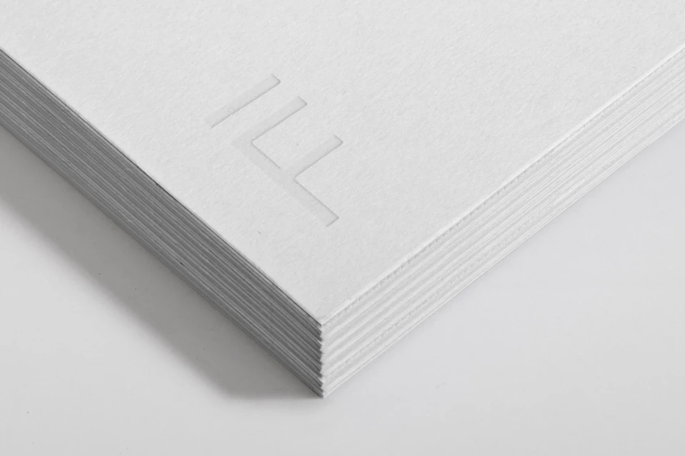
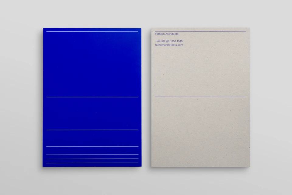
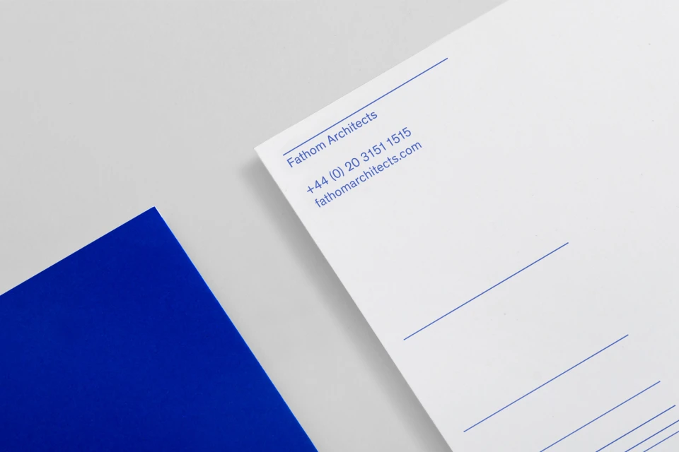
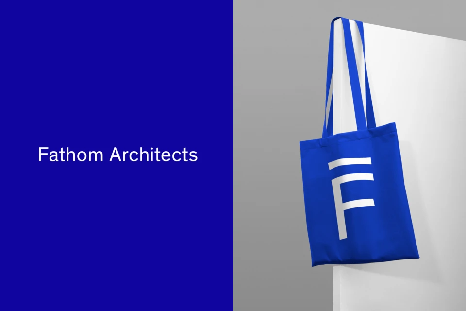
The brand identity for Fathom Architects marks a sophisticated evolution in the real estate and property sector, prioritizing geometric precision and architectural clarity to redefine the firm's visual presence. Executed with a rigorous commitment to minimalist design, the project leans into a disciplined color palette of royal blue and neutral grey to anchor its corporate identity. The visual strategy effectively utilizes commercial photography and studio strobe lighting to elevate standard stationery and branded collateral into tactile, professional assets. Through a focus on typography and high-quality paper stock, the design team at DNCO emphasizes clean lines and intentional spacing, turning functional items like document tubes, adhesive tape, and canvas totes into cohesive extensions of the firm's structural expertise. Each element, from the debossed logos in macro shots to the sharp, flat-lay compositions of the dual-sided stationery, speaks to an aesthetic of order and refined technicality. By stripping away extraneous noise, the identity system creates a lasting impression of stability and professional excellence, ensuring that every touchpoint—whether a physical print or a digital asset—reflects the exacting standards expected in modern architectural practice. The deliberate use of pinstripes and sans-serif type serves as a recurring motif that reinforces the firm's brand cohesion, ultimately establishing a distinctive and memorable persona that resonates throughout the competitive landscape of professional real estate platforms.
Horizontal, Commercial, Clean, Minimalist
Typography
Website / Web
