
Indigo: Brand Identity

Oct 2022
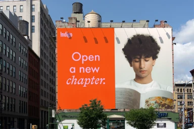
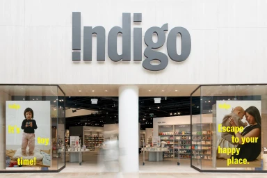
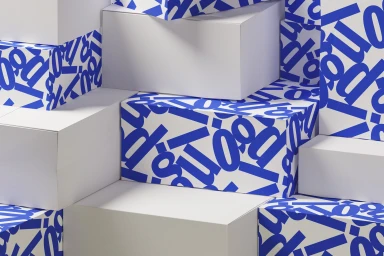
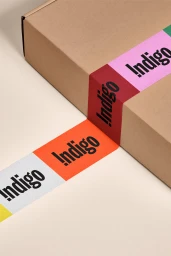
Indigo’s brand identity project establishes a comprehensive visual system centered on bold typography and a vibrant, multi-tonal color palette. The execution spans across diverse applications, ranging from retail store signage and outdoor billboard displays to structural packaging design and kinetic motion graphics. By utilizing a mix of serif and sans-serif fonts, the work creates a clean, structured aesthetic across both physical and digital touchpoints. Wedge provided the graphic design, which prioritizes minimalist layouts and geometric compositions. The identity leans into a modular approach, as seen in the 3D rendered packaging and animated brand guideline presentations. This consistent visual language anchors the brand's presence, whether through the precision of custom paper tape branding or large-format architectural displays.
Clean, Horizontal, Commercial
