
Hillwood: Brand Identity
Jun 2020
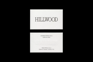
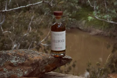
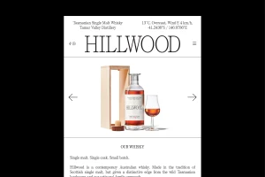
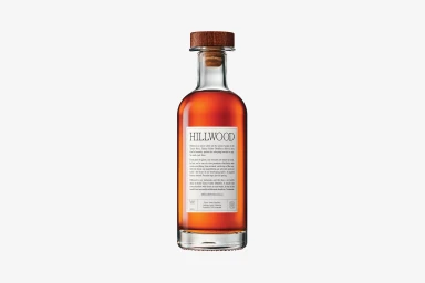
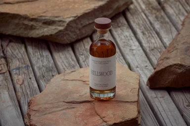
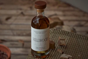
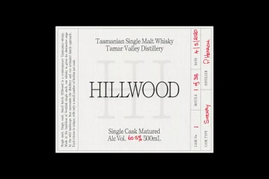
Hillwood’s brand identity project captures the raw, rugged soul of Tasmanian single malt whisky through a lens of sophisticated minimalism. By blending corporate precision with artisanal storytelling, the visual system honors the Tamar Valley Distillery’s small-batch ethos while maintaining a high-end commercial presence. Graphic design firm Never Now anchors the identity in clean, deliberate typography, utilizing textured cardstock and thoughtful deboss techniques to create a tangible, premium experience that speaks to the craftsmanship of the spirit itself. This corporate design is elevated by the lens of photographers DH-Z Photography and Josh Robenstone, who transition seamlessly between controlled studio packshots and cinematic, natural light environments. Whether set against the weathered, lichen-spotted sandstone of the Tasmanian wilderness or displayed with clinical clarity on a neutral background, the product shots emphasize the amber depth of the whisky and the structural integrity of the bottle. The overall aesthetic leans into editorial minimalism, further enriched by the handwritten details on the labels which ground the brand in authentic, human-led production. With supporting copywriting by Hayley McKee and web development by Mr Kyle Mac, the project establishes a cohesive, professional narrative that connects the drinker directly to the geographic origin and specific cask heritage of the whisky, resulting in a refined identity that feels both timeless and distinctly local.
Commercial, Clean
Natural light
E-commerce / Product


