
Granger: Brand Identity








Apr 2019
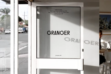
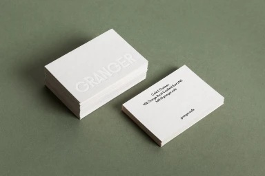
The brand identity for Granger, a contemporary player within the competitive restaurants, food, and beverage industry, channels a sense of refined utility through a meticulously curated visual system. By emphasizing a minimalist aesthetic, the project successfully bridges the gap between everyday hospitality and high-end corporate identity. The visual language relies on a disciplined palette of sage green, cool grey, and crisp white, grounded by the natural, tactile textures of marble and paper stock. This cohesive approach to visual communication is executed through a series of commercial assets that range from architectural signage and printed stationery to branded workwear and functional retail packaging. The project effectively utilizes typography as its primary graphic anchor, employing clean sans-serif fonts to maintain a modern, uncluttered look across all touchpoints. By prioritizing natural light and soft light techniques, the imagery captures the organic elegance of the space, ensuring that the brand feels both approachable and sophisticated. Whether it is the subtle emboss and deboss details on business cards or the fluid motion captured in live-action techniques during coffee service, the brand identity remains consistent and intentional. Through this thoughtful design lens, the Granger brand identity establishes a clear, recognizable presence that translates seamlessly from physical environments into the broader digital and retail landscape.
Horizontal, Commercial, Clean
Natural light
