
Glaze
Brand Identity
Jul 2021
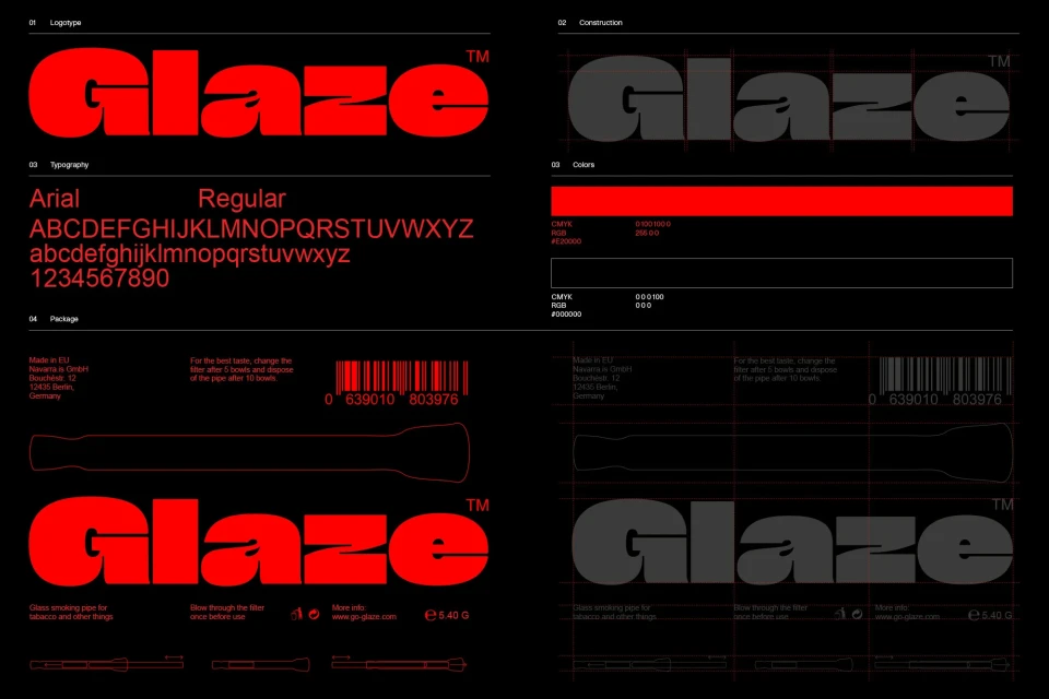
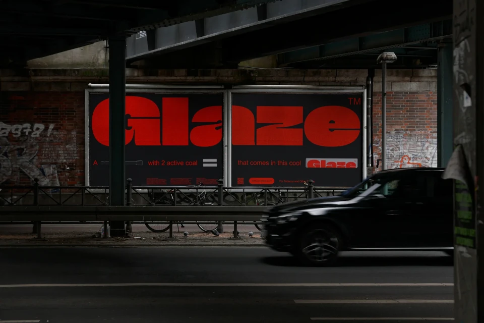
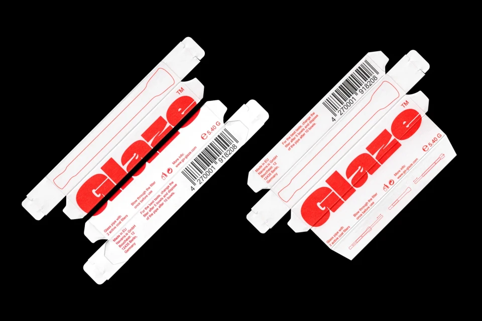
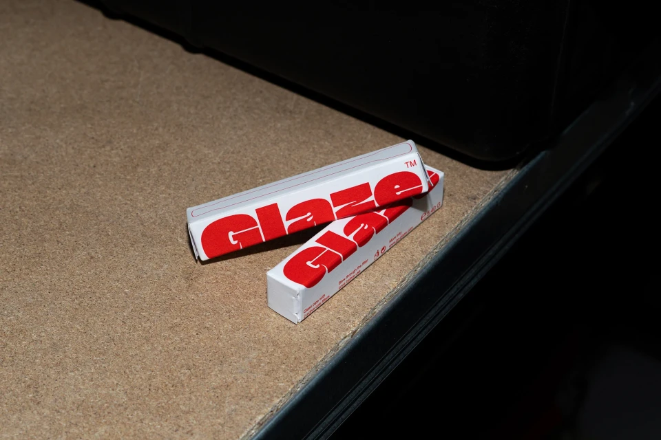
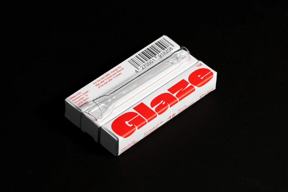
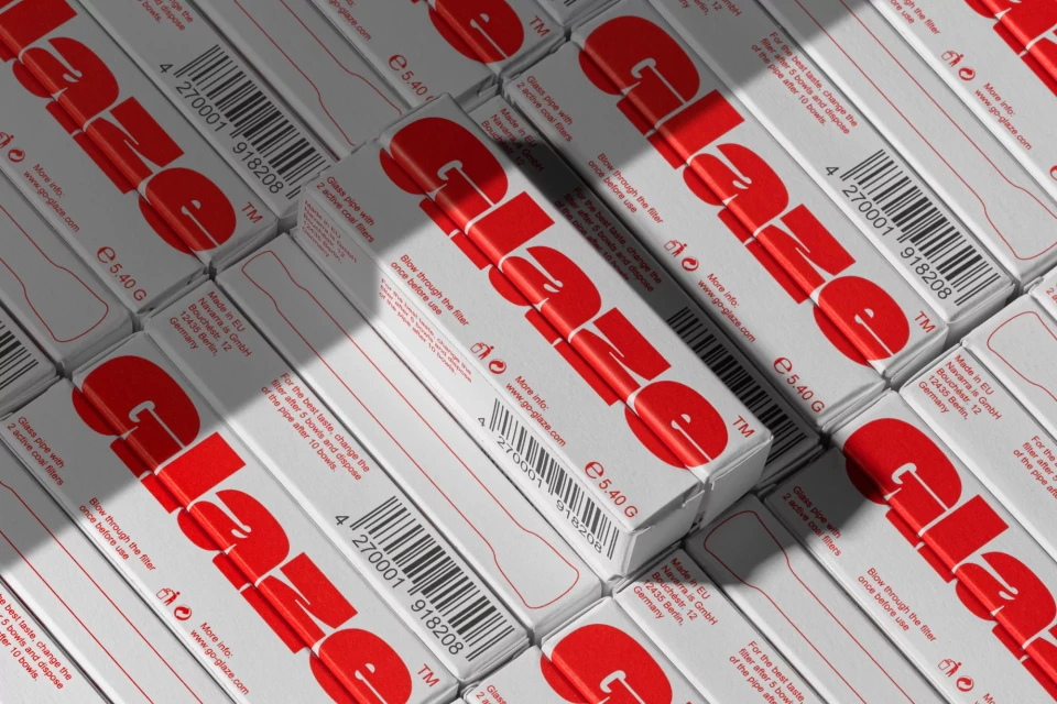
Navarra.is developed a comprehensive brand identity for Glaze, focusing on a minimalist aesthetic that relies on bold typographic arrangements and a stark red and black color palette. The project spans print collateral and packaging design, utilizing Munken Pure paper stocks from Arctic Paper to reinforce the tactile, clean presentation of the brand’s visual system. Executed with a focus on graphic precision, the identity features custom logotype construction and structured grid systems for packaging. The rollout includes environmental applications and motion graphics, utilizing flash and natural light to emphasize the sharp contrast between the white packaging components and dark background elements. The work maintains a consistent visual language across all digital and physical assets.
Horizontal, Commercial, Clean


