
OM: Brand Identity


Jul 2020
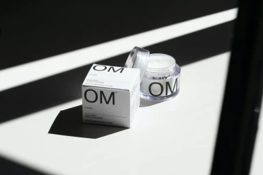
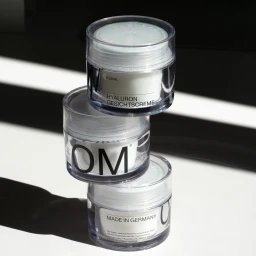
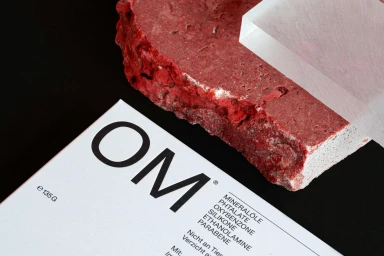
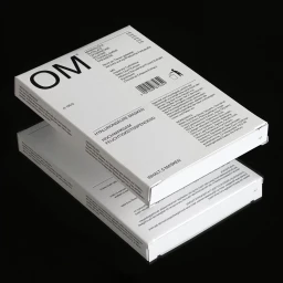
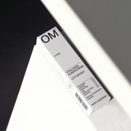
In a market often cluttered with excessive ornamentation, the brand identity for OM skincare carves out a distinct space by embracing a philosophy of clinical restraint. This project, which meticulously defines the visual language for the brand, leans into a stark, architectural minimalism that speaks to a modern, professional consumer. Through a series of commercial product shots, the identity is brought to life using high-key lighting and cinematic macro techniques that celebrate the structural integrity of the packaging. The bold, sans-serif typography on matte white surfaces is deliberately contrasted against natural, organic elements like raw mineral stone, creating an aesthetic that feels both methodical and sophisticated. Navarra.is, responsible for the graphic design, successfully anchors the brand in a refined, laboratory-inspired visual framework. By utilizing natural light and intentional hard light shadows, the imagery emphasizes the purity of the ingredients and the precise engineering behind the skincare formulas. The resulting portfolio reads as a study in balance, where the interplay of translucent materials, sharp-edged geometry, and controlled monochromatic palettes reinforce a premium, German-made reputation. This brand identity effectively bridges the gap between pharmaceutical transparency and elevated cosmetic appeal, ensuring that OM feels as much at home in a high-end apothecary as it does in a contemporary design gallery, standing out through its unwavering commitment to clean, disciplined, and highly readable branding.
Horizontal, Commercial, Clean, Minimalist
White Seamless
E-commerce / Product
