
A26: Brand Identity
Oct 2020
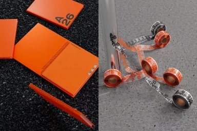
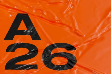
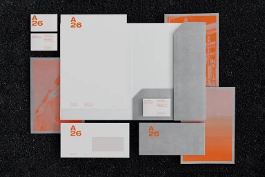
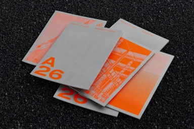
Massiera Samadi developed the brand identity for A26, a graphic design project that explores contrast through a palette of bright orange and monochrome tones. The work features a suite of stationery, including letterheads, folders, and brochures, which leverage tactile paper stock from Arctic Paper. The project channels a minimalist aesthetic, utilizing bold typography and geometric graphics to define the visual system. Across the collateral, the design leans into tactile textures by juxtaposing crisp, clean lines against raw, coarse backdrops like gravel and asphalt. The execution highlights material quality through screen print treatments and sharp typographic arrangements.
Horizontal, Commercial, Clean, Minimalist
Typography
Concrete Texture
Advertising Campaign


