
DMEXCO: Brand Identity

Dec 2019
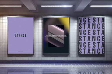
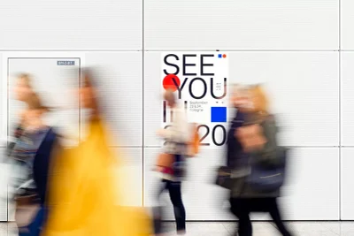
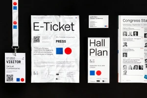
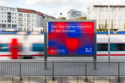
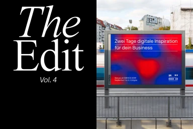
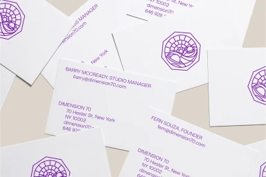
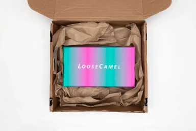
The brand identity work for DMEXCO serves as a masterclass in modular, high-impact corporate design that successfully bridges the gap between digital marketing innovation and tangible urban presence. Across a diverse array of touchpoints—from large-scale transit billboards to meticulously arranged event collateral—the project leans into a minimalist aesthetic defined by bold typography and a striking palette of vibrant gradients. By juxtaposing stark red and blue geometric motifs against fluid, abstract backgrounds, the design system maintains a consistent visual language that feels both authoritative and approachable. The execution expertly navigates the constraints of various formats, utilizing UI illustration techniques to ensure that complex conference information remains readable yet visually compelling. Whether framed by the industrial backdrop of a subway station or captured in a crisp, clean flat lay, the identity feels inextricably linked to the pulse of modern business culture. Elements of commercial, corporate design are softened by deliberate cinematic touches, such as the strategic use of motion blur in environmental photography to signify the rapid pace of the digital landscape. Through the collaborative contributions of teams at Navarra.is, Forma, Redscout, and Ashley Kinnard, this project succeeds in transforming functional event materials into a cohesive, memorable brand experience that captures the essence of digital inspiration in a physical, real-world context.
Horizontal, Commercial, Clean


