
George C.: Brand Identity




Dec 2020
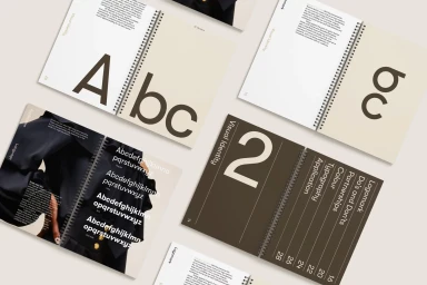
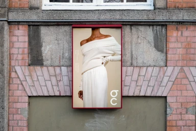
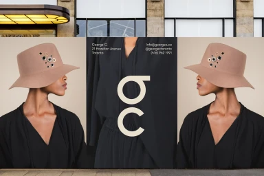
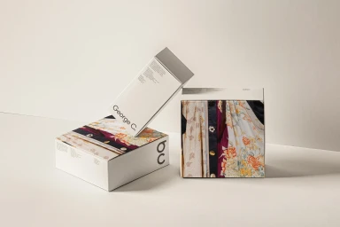
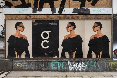
George C. establishes a cohesive brand identity that merges high-fashion editorial aesthetics with practical retail application. The visual system, developed by graphic designer Fook, leverages bold sans-serif typography and structured grid layouts to create a clean, minimalist foundation across digital and physical touchpoints. Captured by photographer Vita Cooper, the campaign imagery features model Shania Amanika. The execution spans diverse formats, ranging from outdoor billboard displays and street-level signage on historic architecture to detailed product packaging and stationery. The project utilizes natural light to maintain a polished, sophisticated look that emphasizes paper textures and geometric branding elements.
Horizontal, Commercial, Clean


