
B's Bees: Brand Identity

Oct 2020
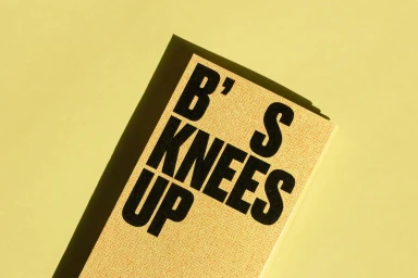
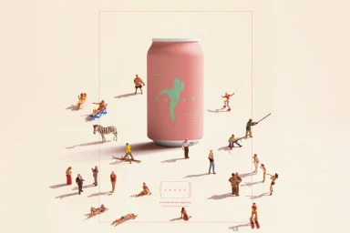
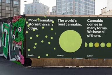
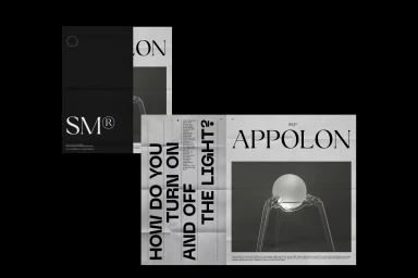
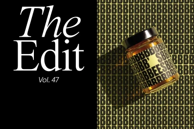
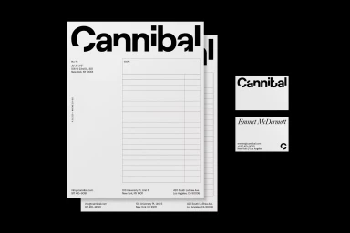
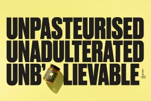
B's Bees introduces a cohesive brand identity system that leverages bold, high-contrast typography and a recurring yellow-and-black palette. The work spans various commercial touchpoints, from packaging and stationery suites to large-scale out-of-home posters. Utilizing clean graphic presentation and minimalist layout principles, the project establishes a distinct visual language through geometric forms and structured grid alignments. The execution incorporates 3D render and CGI techniques to highlight product design, as seen in the treatment of glass honey jars and conceptual dioramas featuring miniature figurines. By integrating sharp, hard lighting, the identity gains a physical presence that grounds its two-dimensional graphic elements. The project was developed through the collaboration of Mean, The Refreshment Club, Fook, Bruno Arizio, and M M NT.
Horizontal, Commercial, Clean
Advertising Campaign


