
Brand
ProjectBrand Identity
George C. Brand Identity 2020
Associated creatives


Tags
Description
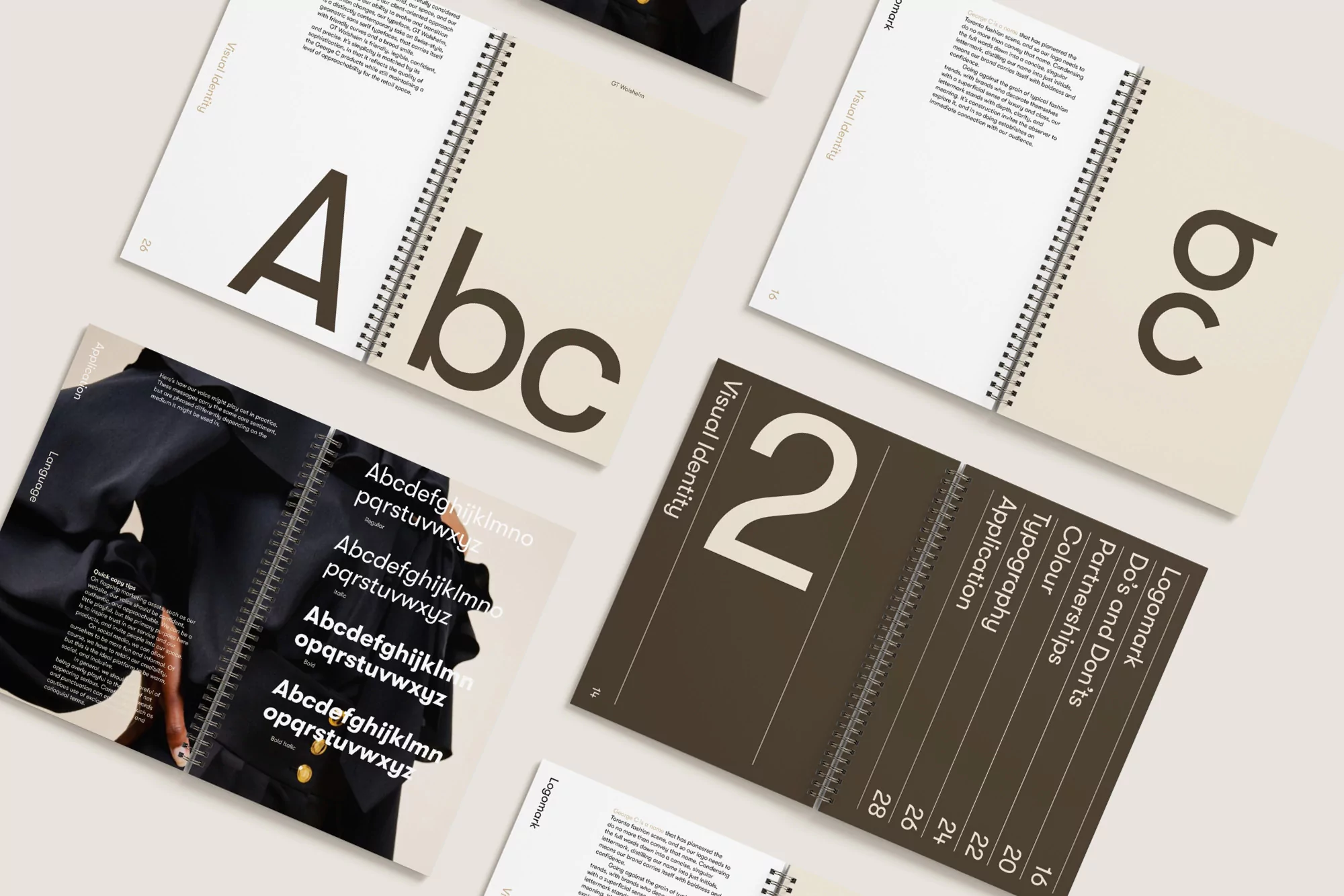
This flat lay composition showcases the comprehensive brand identity and typography guidelines for George C., created by graphic designer Fook, photographed by Vita Cooper, and featuring model Shania Amanika. Multiple spiral-bound notebooks and guideline documents are arranged across a clean surface, displaying bold sans-serif letterforms, alphabetical character sets, numerical sequences, and structural grid layouts. The pages combine neutral beige backgrounds with contrasting dark brown typography, showcasing sections dedicated to visual identity, logomarks, colour palettes, and application rules. The overhead perspective emphasizes the tactile quality of the paper stock, wire bindings, and clean editorial layout of the brand collateral.