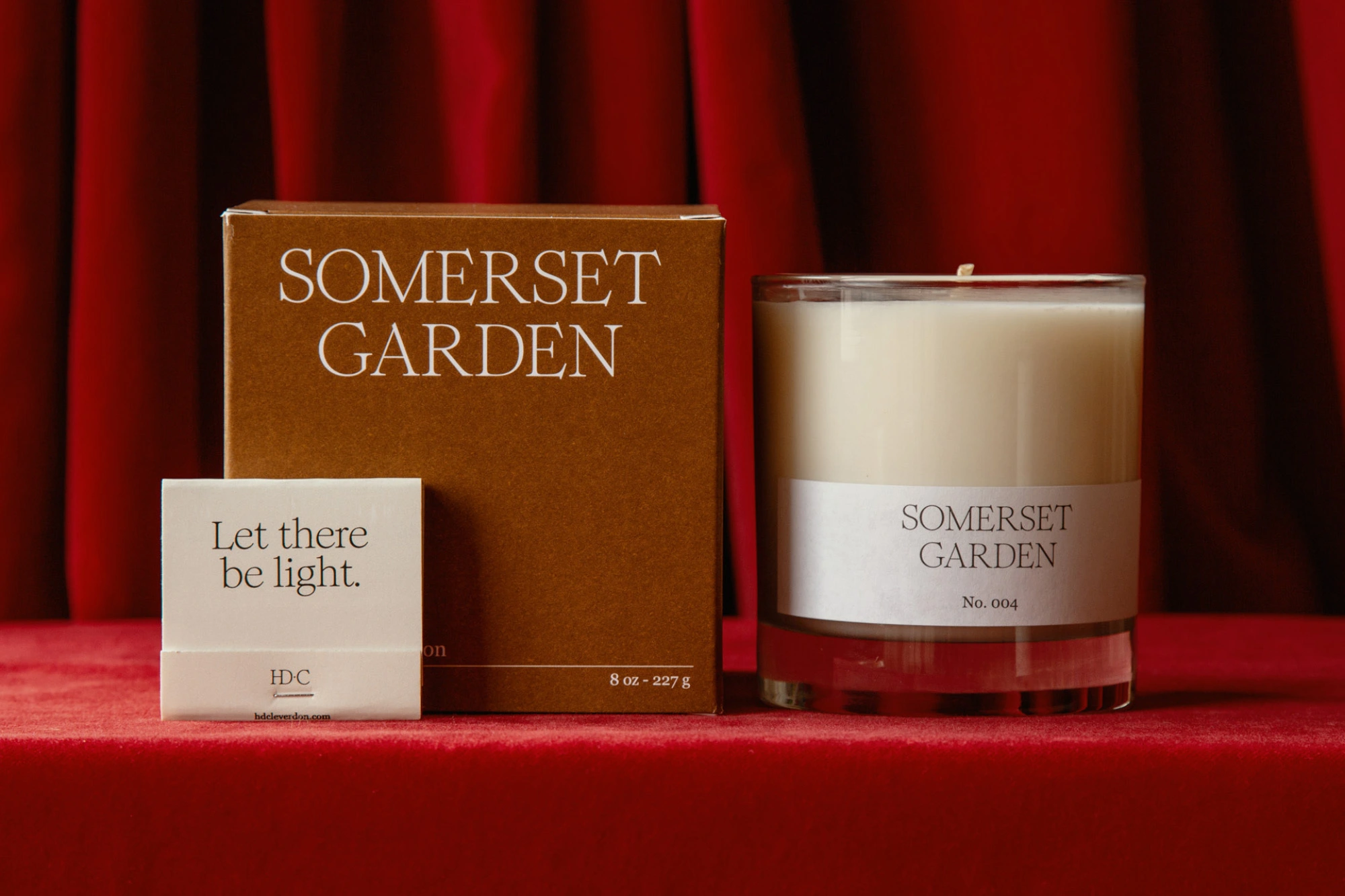
This brand identity project for H.D. Cleverdon establishes a cohesive visual language across the company's candle collection and packaging suites. The work integrates serif typography and a minimalist aesthetic to highlight the brand's tactile product range, ranging from individual glass-jar candles to protective honeycomb paper packaging.
Fook led the graphic design, which channels a clean, commercial sensibility through an earthy color palette and warm, natural light. The identity extends from physical product surfaces and e-commerce web design to large-scale outdoor billboard applications in urban environments.