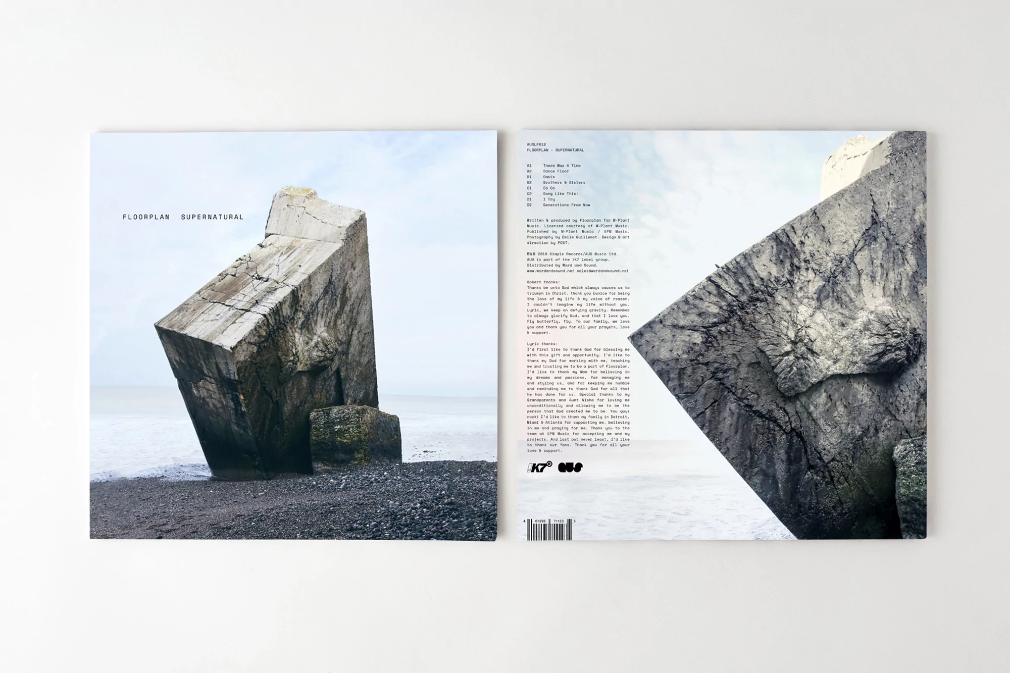
Floorplan Brand Identity 2020
About
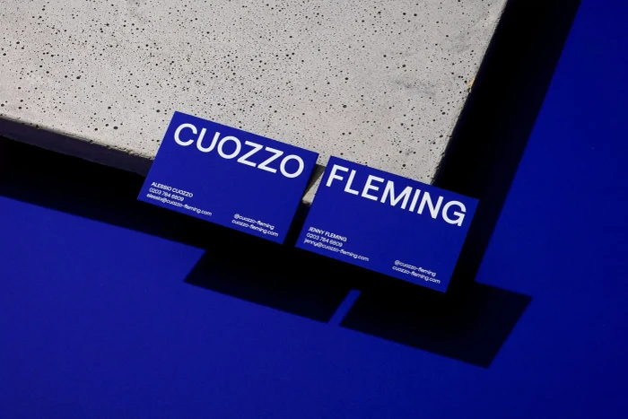
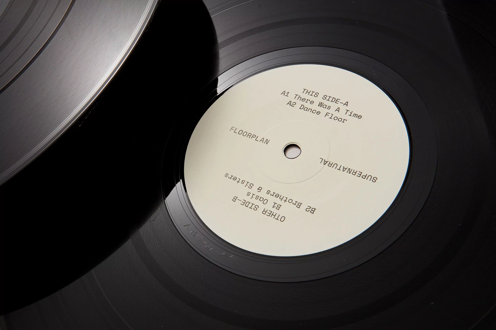
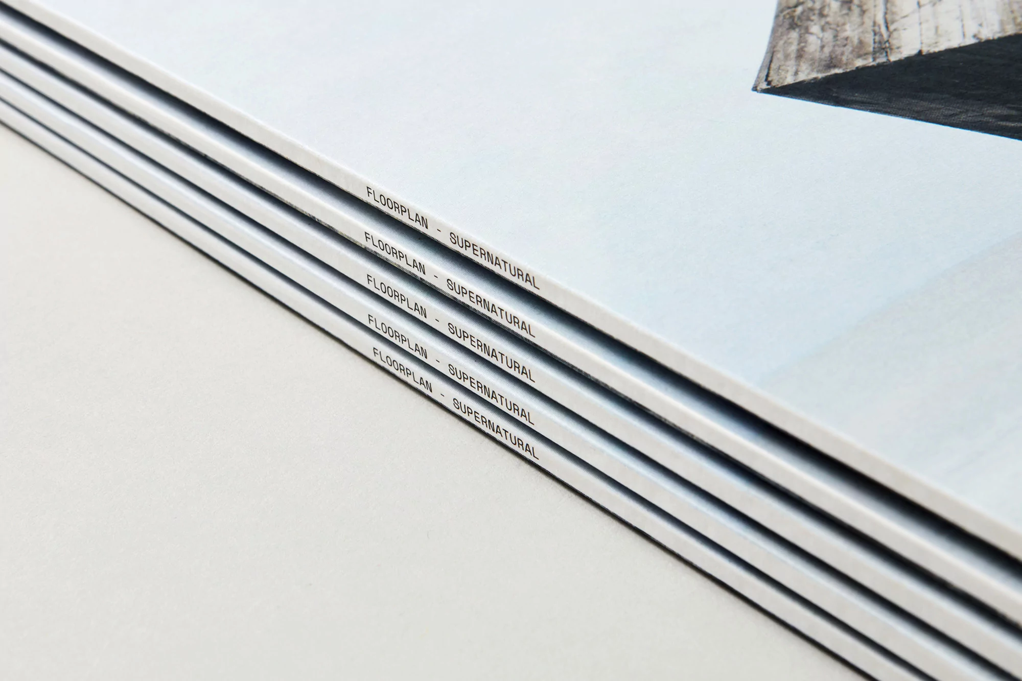
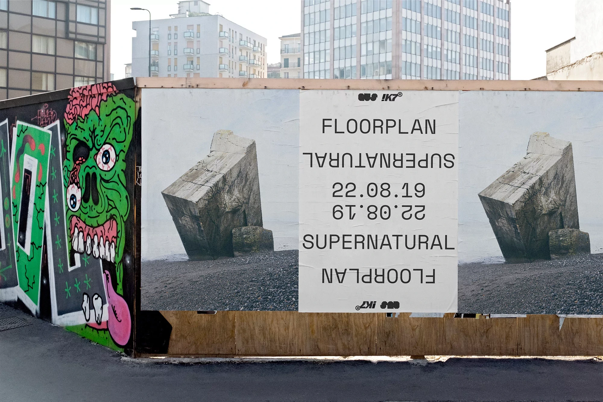
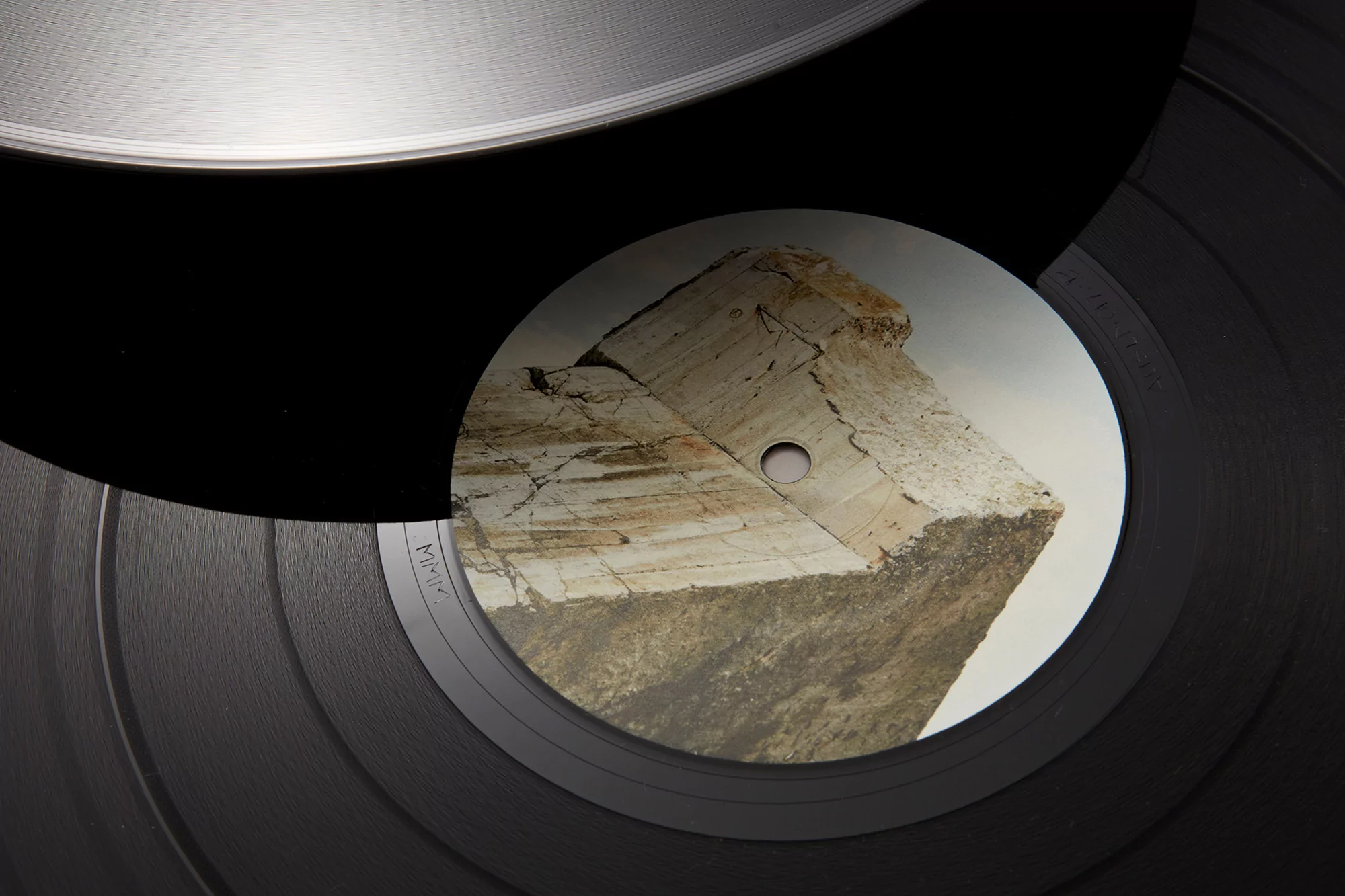
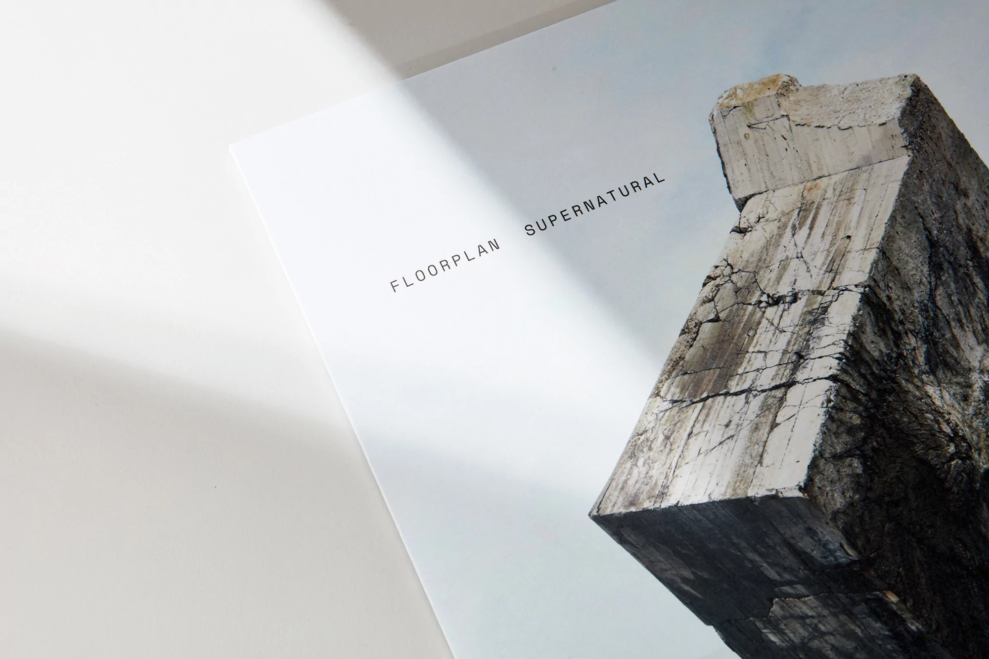
The brand identity project for Floorplan, titled Supernatural, masterfully bridges the gap between raw industrial aesthetics and the refined minimalism of contemporary music marketing. By leaning into a stark, architectural visual language, the project transforms the tactile experience of vinyl record packaging into a coherent narrative. The design strategy, executed with precision by the team at POST, utilizes a sophisticated sans-serif typography that grounds the entire identity, ensuring that the bold lettering serves as a sharp counterpoint to the organic, weathered textures featured throughout the collateral. Through the lens of photographer Emile Guillemot, the campaign captures a series of striking juxtapositions—placing the smooth, concentric grooves of vinyl discs against the rugged, mineral-heavy facets of stone monoliths and concrete coastal structures. These elements, presented through macro photography and deliberate editorial framing, elevate the record beyond simple product design into an artistic statement. The result is a clean, modern aesthetic that feels both grounded and expansive, effectively utilizing soft light to pull depth from everyday urban environments and printed materials alike. Whether seen as a large-scale poster on an industrial hoarding or as a meticulously stacked series of brochures, the work maintains a distinct clarity. This identity project successfully captures the interplay between corporate precision and atmospheric naturalism, resulting in a cohesive brand identity that feels perfectly in tune with the music, media, and entertainment landscape.