
Field Office Architecture: Brand Identity


Aug 2020
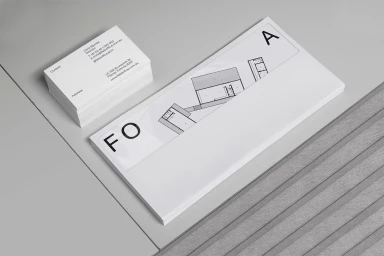
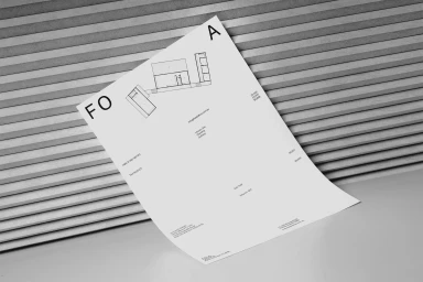
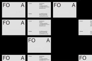
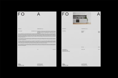
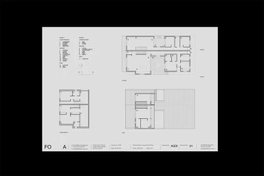
The brand identity for Field Office Architecture, crafted by the design team at SPGD, establishes a sophisticated visual language that is as precise as the blueprints the firm produces. By leaning into an aesthetic of editorial minimalism, the project elevates the firm’s corporate presence through a restrained palette of monochromatic tones and sharp, grid-based layouts. The identity relies heavily on bold, sans-serif typography that communicates clarity and professional rigor, effectively anchoring the brand across various touchpoints—from high-contrast signage and sleek stationery sets to utilitarian hardware like branded safety helmets. The creative execution utilizes soft light and natural textures to soften the austerity of the architecture, ensuring the brand feels both grounded and modern. By integrating elements like 3D render techniques for abstract product shots alongside technical floor plan diagrams, the identity creates a cohesive narrative that spans from high-level corporate branding to the nuanced details of daily project documentation. This graphic system succeeds by prioritizing negative space and geometric alignment, resulting in a clean, highly structured look that mirrors the firm’s own architectural output. The result is a refined, cohesive corporate identity that balances industrial functionality with a polished, contemporary sensibility, ensuring that every document and hard hat serves as a clear, deliberate extension of the Field Office Architecture brand ethos within the competitive real estate landscape.
Horizontal, Commercial, Clean, Minimalist
Typography
