
2DADS: Brand Identity

Jun 2022
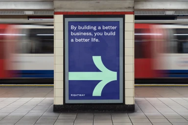
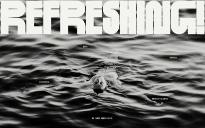
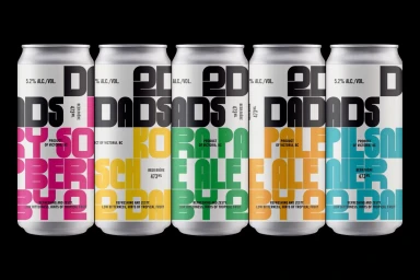
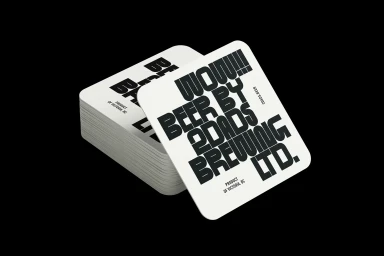
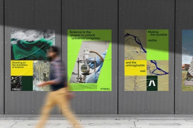
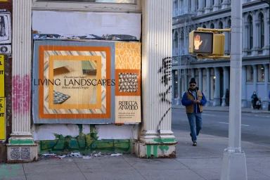
The brand identity for 2DADS spans a diverse array of assets, integrating graphic design and commercial photography to establish a visual language across various product and outdoor contexts. The project utilises a mix of minimalist product shots, such as high-contrast beverage packaging and supplement box arrangements, alongside dynamic urban advertising. The campaign leverages clean typography and bold color blocking, moving between graphic, minimalist compositions and high-contrast, film-like imagery to build a cohesive brand presence. Executed through a collaborative effort involving Pentagram, Orchidea Agency, Order, DNCO, and Ocular, the work relies on a combination of 3D render and CGI techniques alongside natural light photography. The visual identity adapts across mediums, from large-scale subway billboards and wheat-pasted urban posters to precision product staging, emphasizing a structured, modern aesthetic.
Horizontal, Commercial, Clean


