
eyesprint: Brand Identity




Apr 2020
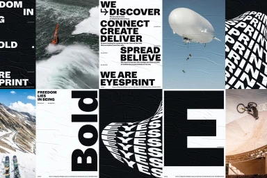
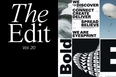
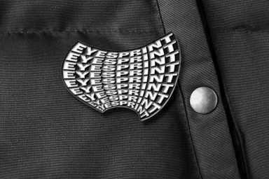
The brand identity work for Eyesprint stands as a masterclass in modern corporate communication, bridging the gap between raw, adventurous storytelling and disciplined commercial design. Developed through a sophisticated lens, the project weaves together a narrative that feels both tactile and expansive. By leveraging a high-contrast black and white palette alongside dynamic action photography—featuring everything from high-altitude airships to turbulent oceanic waves—the identity creates a visual tension that is undeniably arresting. This project leans into editorial minimalism, utilizing bold, distorted typography to build a rhythmic, grid-based aesthetic that remains consistent across diverse media touchpoints. Whether applied to the clean, symmetrical packaging of gourmet honey and olive oil or the intricate, industrial finish of custom enamel pins, the design vocabulary remains remarkably cohesive. The work, which features contributions from IYA Studio and Studio L'Ami among others, avoids the trap of repetitive branding by allowing each application to breathe within its own context. From the soft, dappled light of the print brochures to the precise graphic layouts of the product line, the identity effectively utilizes typography as both a structural anchor and a decorative element. This is a comprehensive study in how refined brand systems can translate across physical textures and digital surfaces, maintaining a sharp, modern edge while retaining enough personality to stand out in a saturated commercial landscape.
Horizontal, Commercial, Clean


