
Embla
Brand Identity
Oct 2016
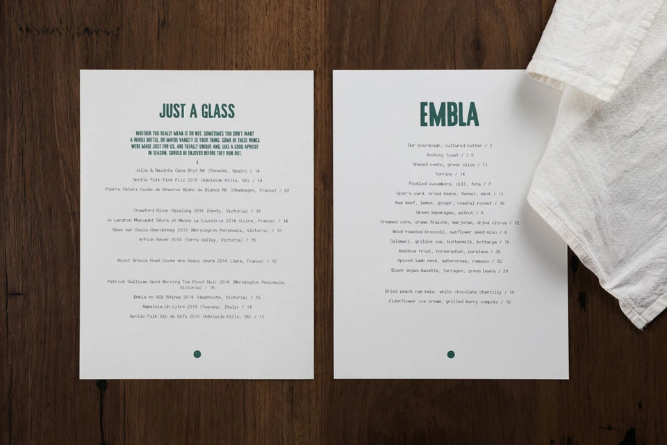
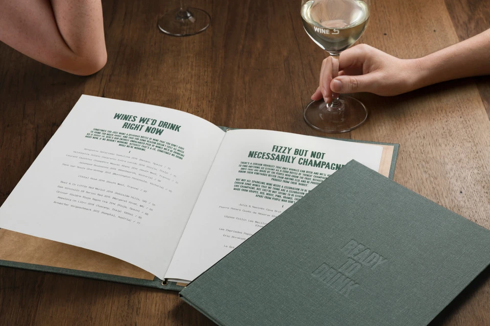
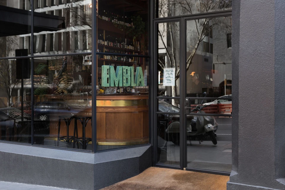
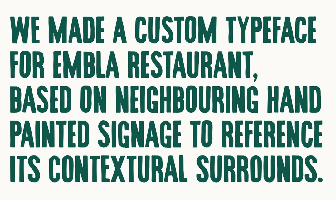
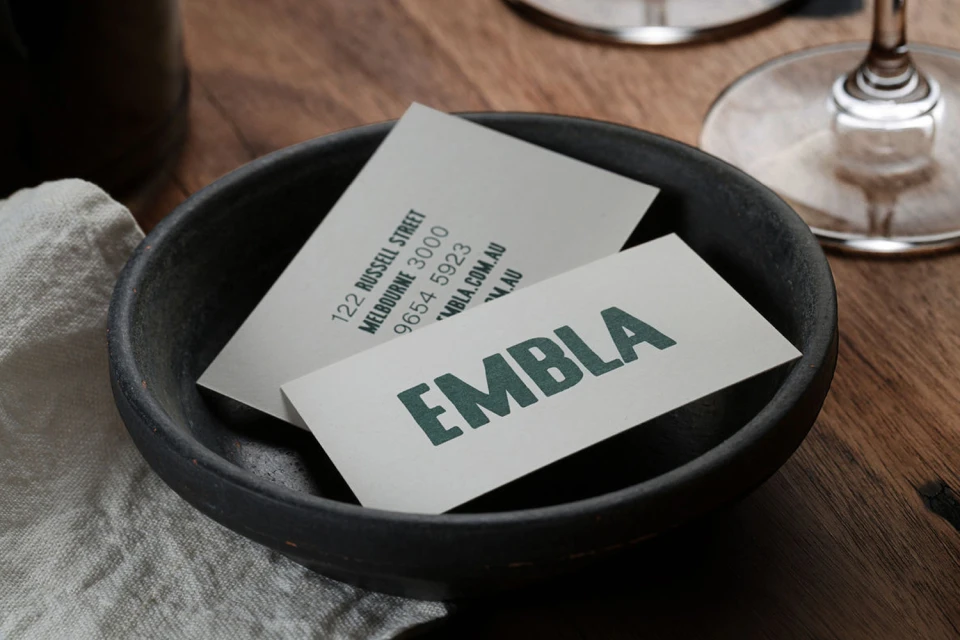
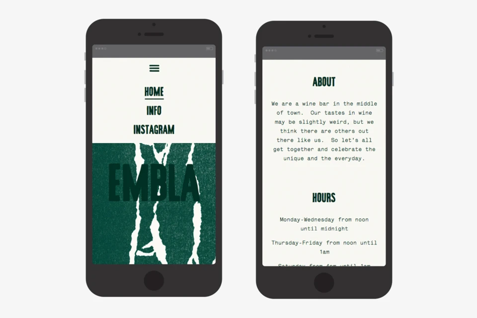
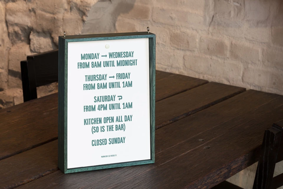
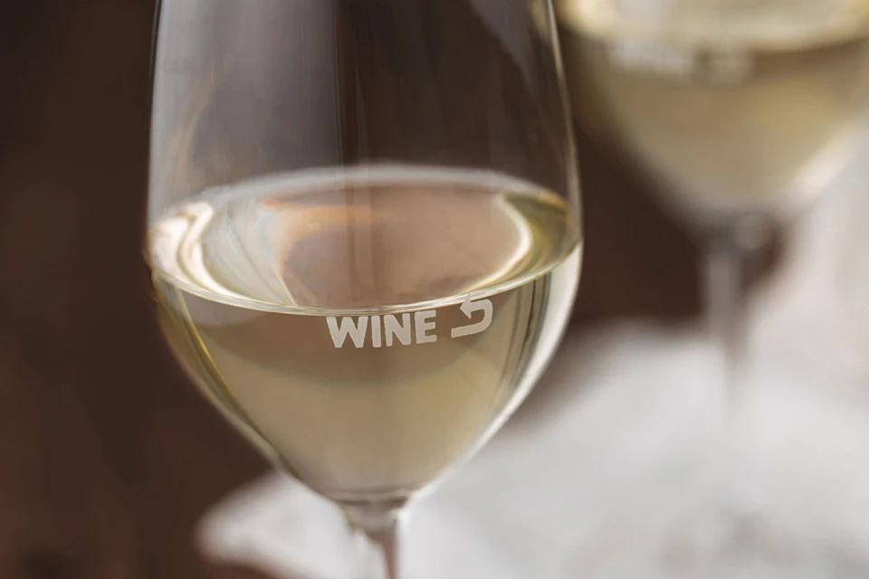
For the restaurant brand Embla, the creative studio A Friend of Mine has crafted a cohesive brand identity that perfectly bridges the gap between high-end hospitality and local, neighborhood charm. This comprehensive project encompasses everything from print collateral and architectural signage to digital mobile interfaces, all unified by a sophisticated, minimalist design language. The visual strategy leans heavily into a tactile, organic aesthetic, utilizing a rich palette of deep forest green and warm, rustic wood tones to evoke a sense of grounded elegance. Central to the brand identity is a custom-designed sans-serif typeface, which draws direct inspiration from neighboring hand-painted signage to ensure the restaurant feels firmly rooted in its urban environment. Across the suite of assets—including menus, wine glasses, and business cards—the execution demonstrates a mastery of commercial design, using natural light to highlight the texture of premium paper stocks and matte ceramic elements. By integrating cinematic macro photography and editorial-style lifestyle compositions, the work invites patrons into a layered, immersive experience. The result is a clean, modern, and highly considered system that functions with equal precision on a printed menu as it does on a smartphone screen, successfully positioning Embla as a destination that values both craft traditions and contemporary simplicity in the competitive food and beverage sector.
Horizontal, Commercial, Clean
Restaurants
Advertising Campaign
