Kester Black: Brand Identity




Aug 2020
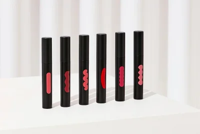
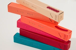
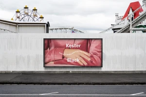
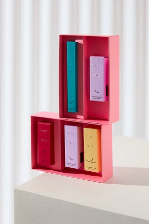
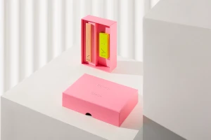
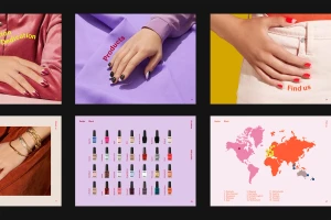
Kester Black’s comprehensive brand identity project redefines the aesthetic landscape of the cosmetics and beauty industry, balancing playful vibrancy with a sophisticated, minimalist editorial approach. Through a meticulous synthesis of commercial product photography and curated graphic design, the identity captures a high-end, tactile experience that feels both accessible and distinctly modern. The visual language leans into a bold, saturated color palette, utilizing soft light and high-key lighting to accentuate the matte textures and modular geometric forms of the packaging. Central to the brand’s presence is a focus on tactile detailing, evidenced by the frequent use of emboss and deboss techniques on everything from lipstick cartons to custom-branded physical cards. Collaborating with creative partners like A Friend of Mine for graphic design and photographers Cubed Studio and Shelley Horan, the project establishes a cohesive, rhythmic consistency across every touchpoint. From the rhythmic stacking of vibrant product cartons to the fluid, organic typography integrated into custom packaging tissue, the identity is unified by its clean lines and confident use of space. This project channels a commitment to ethical beauty while utilizing cinematic and live-action techniques to root the brand in a tangible, urban reality. By merging systematic grids with free-flowing, colorful swatches, the campaign achieves a striking, modular design language that is as versatile as it is visually arresting.
Horizontal, Commercial, Clean
Natural light
White Seamless
E-commerce / Product