
Elkin Editions: Brand Identity
Jan 2021
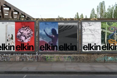
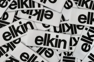
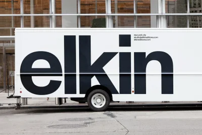
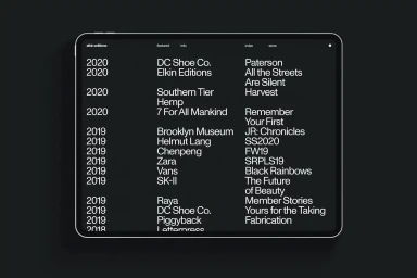
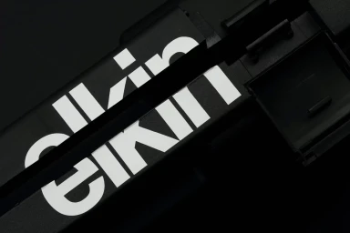
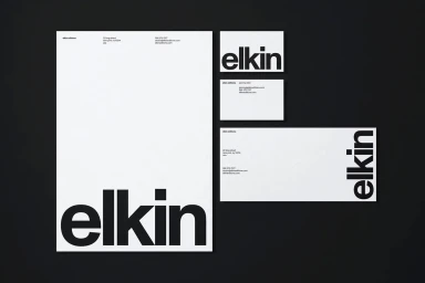
Elkin Editions establishes a distinct visual language through this comprehensive brand identity project. The design system centers on bold, sans-serif typography, utilizing a monochrome palette and minimalist layouts to ensure visual cohesion across various touchpoints. The identity is applied across both physical and digital media, ranging from outdoor poster installations and vehicle branding to stationery suites and custom woven fabric labels. The application emphasizes clean typographic hierarchy, whether set against high-contrast black backgrounds or integrated into urban environments. Developed by Order, the project showcases the scalability of the brand's aesthetic, maintaining clarity and formal consistency in its digital interface and print materials.
Horizontal, Commercial, Clean, Minimalist
Typography
Advertising Campaign
