
Dimoni: Brand Identity
Apr 2018
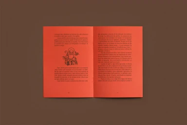
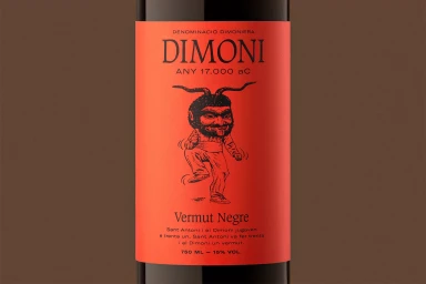
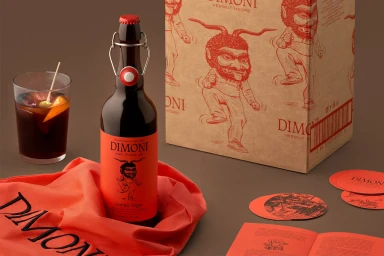
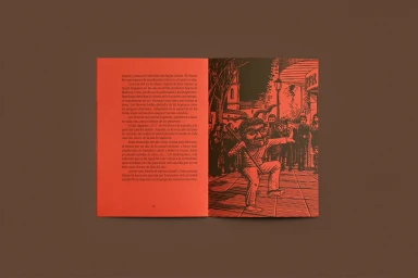
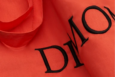
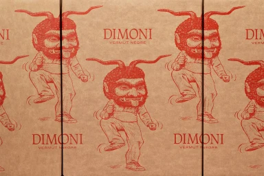
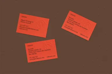
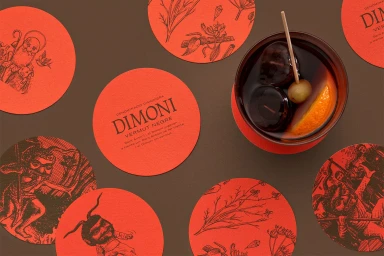
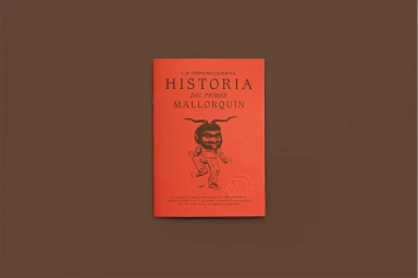
The brand identity for Dimoni, crafted by the design team at Forma, channels a sophisticated synthesis of folkloric tradition and contemporary graphic design. The project establishes a striking visual language through an uncompromising commitment to high-contrast aesthetics, utilizing a vibrant palette of saturated oranges and deep reds against neutral, earthy backdrops. Central to the brand is the recurring motif of a mischievous, dancing devil, rendered with the precise line work of traditional screen print and woodblock techniques. This illustrative depth is balanced by a clean, minimalist approach to typography, where serif and sans-serif fonts provide a structured frame for the more whimsical folkloric imagery. Across the collection—from the textured business cards featuring delicate emboss and deboss detailing to the editorial layouts found in the promotional booklets—every touchpoint feels tactile and deliberate. The studio-shot imagery highlights the physical materiality of the project, emphasizing how high-quality embroidery, paper stock, and ink choice elevate the commercial presentation. By leaning into these heritage-inspired print techniques, the identity successfully bridges the gap between modern corporate branding and an artisanal, story-driven approach. The result is a cohesive, immersive system that feels as much like an art object as it does a commercial identity for a premium vermouth, leaving a lasting impression of artisanal precision and authentic character.
Horizontal, Clean, Commercial
Advertising Campaign
