
Mayer
Brand Identity
Jul 2019
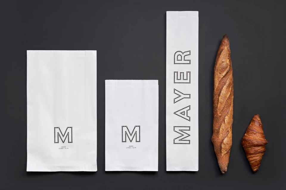
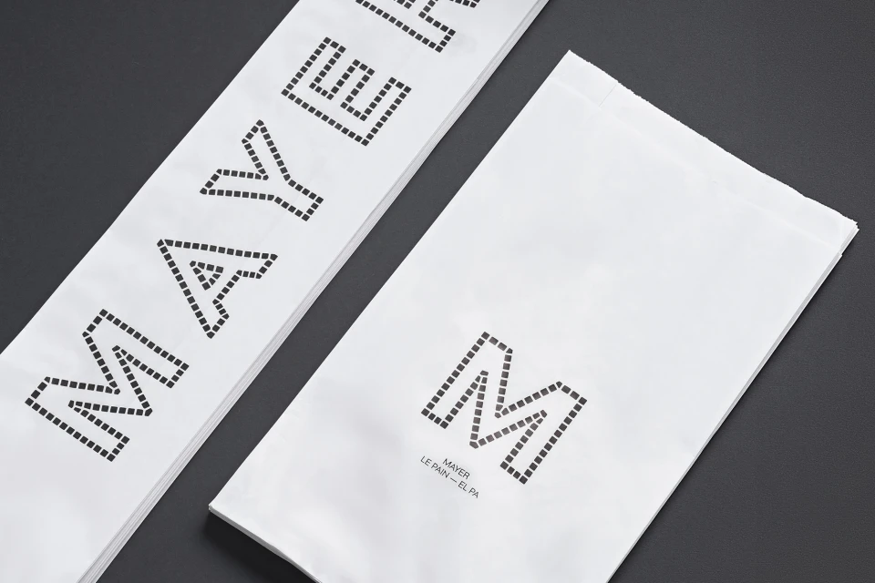
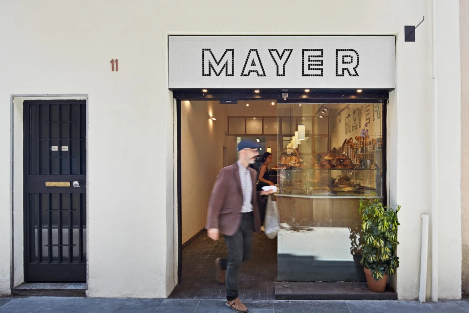
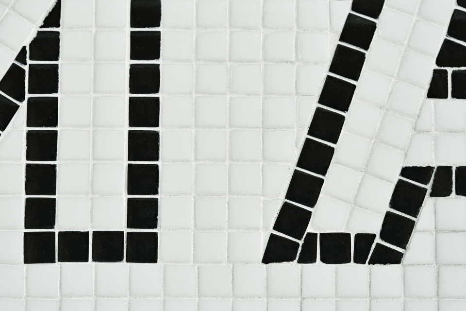
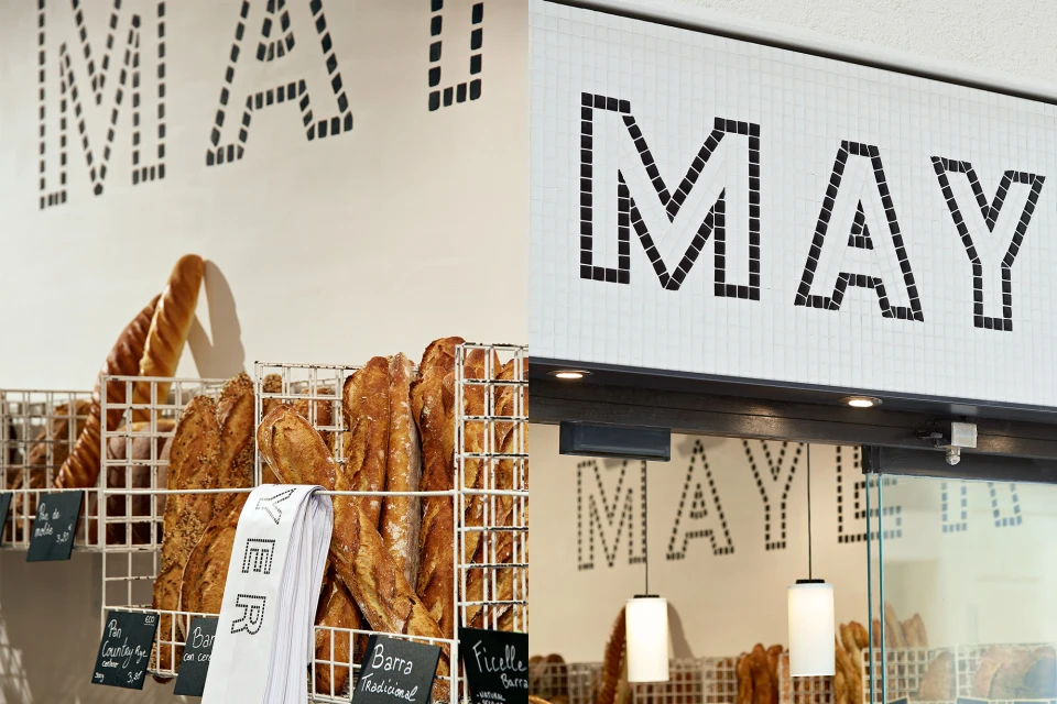
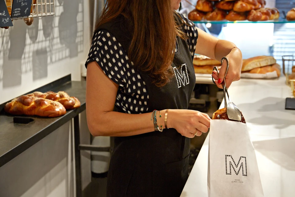
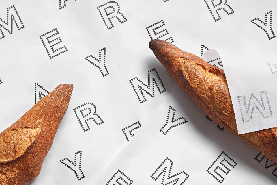
The brand identity for Mayer, a contemporary bakery, bridges the gap between artisanal heritage and modern, high-contrast graphic design. Developed through a collaboration between Forma and Rai Botey, the project leans into a minimalist aesthetic that prioritizes structural precision. By integrating a distinctive dotted typography and a monochromatic palette, the brand identity effectively translates the organic warmth of fresh, crusty bread into a clean, commercial visual language. The execution utilizes a variety of techniques, including macro photography to highlight food textures and live-action documentation to ground the brand within the bustling urban streetscape of the bakery itself. The design system is anchored by a rigid geometric grid, seen in both the custom mosaic tile signage and the stippled paper packaging, which creates a cohesive and professional atmosphere. Soft lighting and carefully composed flat-lay imagery emphasize the interplay between the rough, golden-brown crusts and the sharp, matte surfaces of the branded materials. Ultimately, Mayer succeeds by balancing the tactile, human element of the bakery environment with a highly structured, modern design identity that feels both established and refreshingly sharp. The result is a comprehensive corporate branding suite that elevates the simple act of purchasing a pastry into a considered, aesthetic experience for the consumer.
Horizontal, Commercial, Clean
Restaurants
Advertising Campaign

