
Crane Brothers: Brand Identity


Dec 2024
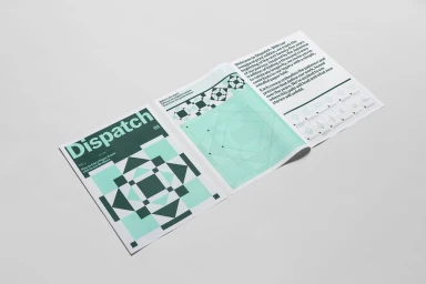
This brand identity project for Crane Brothers centers on a cohesive visual system grounded in geometric patterns and a refined color palette of deep forest green, pale mint, and white. The project spans collateral and editorial elements, including the Dispatch publication, which features structured layouts and detailed origami folding instructions. Graphic design by Liam Ooi emphasizes precision through clean typography and minimal composition. The visual language utilizes origami paper art to reinforce the brand's structural focus, captured through soft, natural light and minimalist staging. The identity system balances flat fields of color with intricate printed details, resulting in a professional and highly organized aesthetic.
Horizontal, Commercial, Clean, Minimalist
Typography
Grey Seamless
Advertising Campaign
