
Carter+Co: Brand Identity


Apr 2022
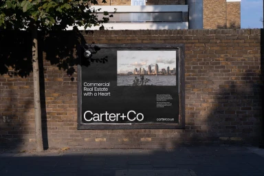
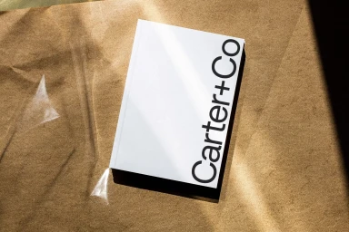
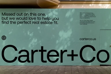
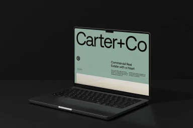
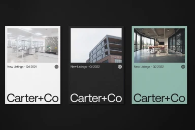
The brand identity for Carter+Co, developed by Visie Admin with graphic design by Mast, establishes a clean visual language across digital and physical touchpoints. The project spans various commercial applications, from outdoor signage and billboards to print collateral and web displays. The system leans into a minimalist aesthetic, utilizing bold sans-serif typography, a muted sage green palette, and high-contrast black and white photography. Through the use of vector-based logos and consistent layouts, the design maintains a cohesive look whether showcased on static hoarding or high-resolution screens. Techniques such as 3D rendering and graphic composition underscore the versatility of the brand assets. The work functions as a complete corporate identity, integrating practical information and visual iconography to represent the company's real estate services.
Horizontal, Commercial, Clean
