
Capsule
Brand Identity


Jul 2016
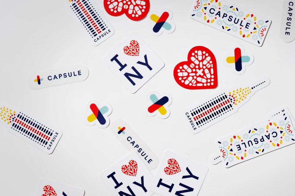
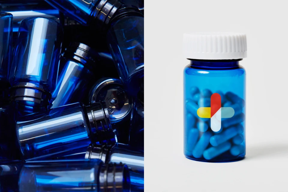
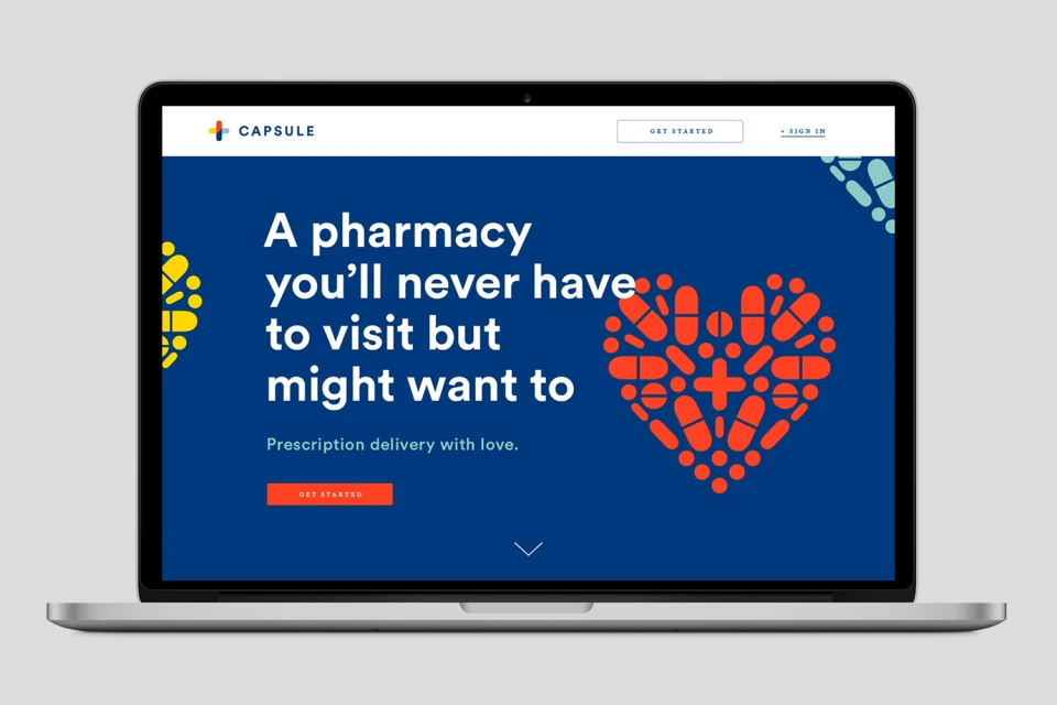
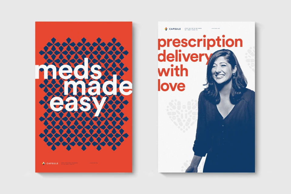
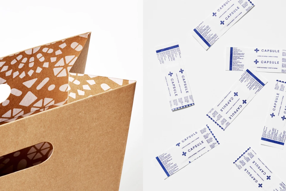
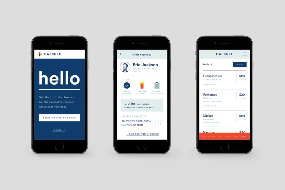
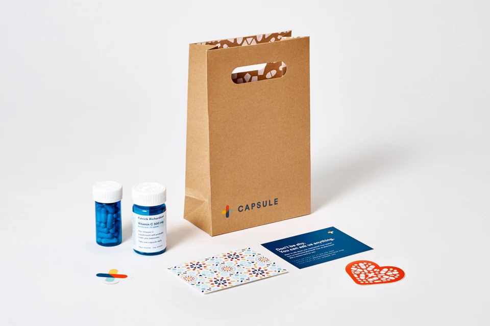
The brand identity for Capsule serves as a masterclass in modernizing pharmaceutical design, stripping away the sterile, dated conventions of the industry in favor of a vibrant and highly accessible visual system. Developed with graphic design expertise from Franklyn, the project manifests as a cohesive ecosystem that bridges physical packaging and digital utility. By utilizing a bold, primary color palette of red, yellow, and navy blue, the design team creates a recognizable visual shorthand that feels both authoritative and approachable. The project successfully leverages high-contrast typography and geometric patterns, ranging from pill-inspired motifs to abstract vector shapes, to establish a distinct corporate identity that feels human-centric rather than cold. Whether applied to clinical prescription bottles, brown kraft paper packaging, or the intuitive architecture of the mobile user interface, the consistency remains striking. Techniques such as studio strobe lighting are employed to accentuate the glossy, clean surfaces of the product containers, while minimalist UI illustration ensures the digital experience remains seamless. This work channels a sense of efficiency and warmth, successfully repositioning pharmacy services as a thoughtful, lifestyle-integrated experience. The result is a sharp, balanced, and remarkably organized system that prioritizes clarity, readability, and brand recognition within a saturated commercial landscape, effectively demonstrating how precise design choices can elevate a functional healthcare service into a compelling, contemporary brand.
Horizontal, Commercial, Minimalist, Graphic, Clean
Typography, Vector
Apps & Digital Platforms
White Seamless
Advertising Campaign
