
Redscout
Brand Identity




Nov 2015
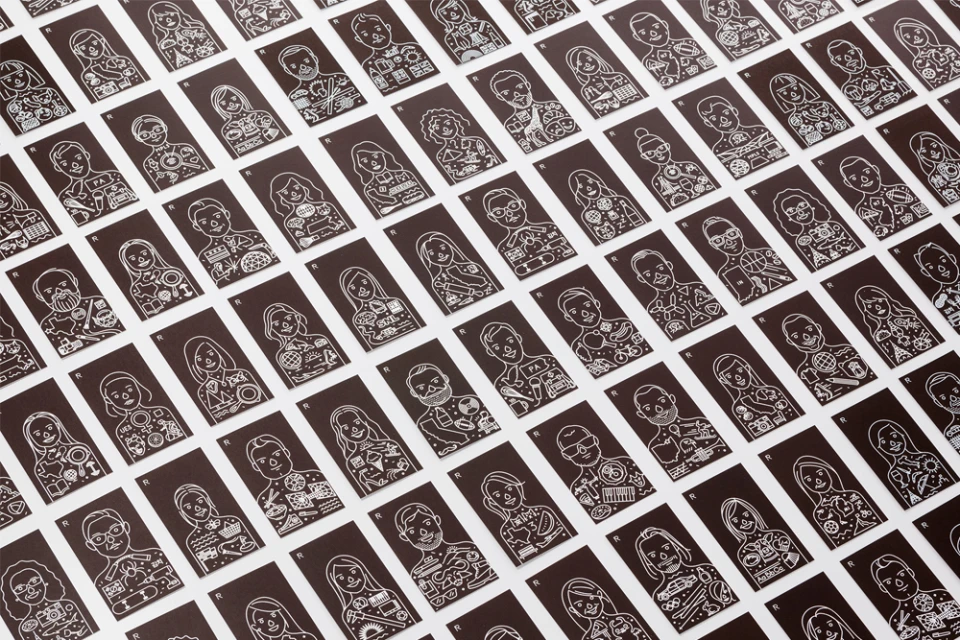
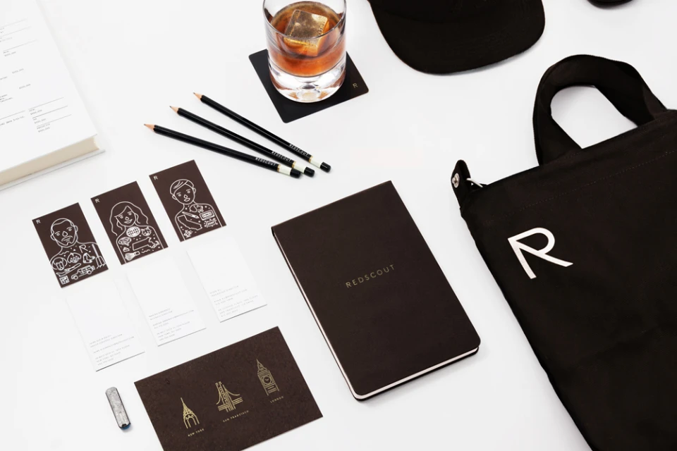
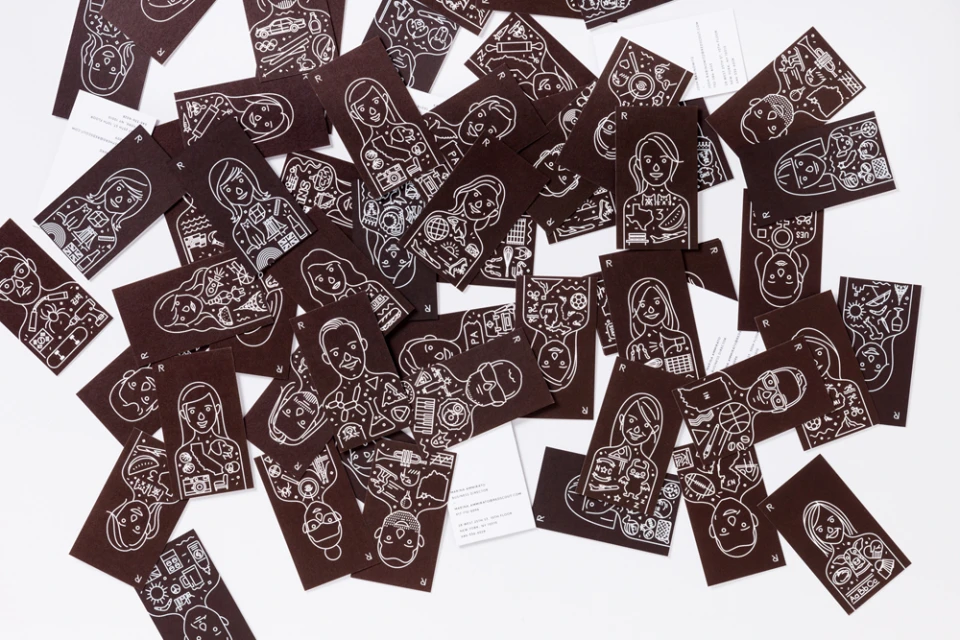
The brand identity overhaul for Redscout is a masterclass in minimalist design, stripping back the corporate aesthetic to favor a sophisticated, illustrative visual language. By grounding the brand in a high-contrast palette of deep brown and sharp white, the creative team at Franklyn has crafted an identity that feels both premium and deeply personal. The project leans into the power of vector-based line art, utilizing intricate, hand-drawn-style symbols to build out a suite of assets that are as narrative as they are functional. Whether rendered as a repeating pattern of stylized human faces or a singular geometric logotype, each component reflects a commitment to clean typography and intentional graphic composition. The application of these elements across collateral—from matte-textured business cards to functional canvas goods—demonstrates a cohesive brand system that prioritizes clarity and texture. By integrating diverse icons into the silhouettes of human portraits, the work transforms standard corporate stationery into a series of playful, symbolic stories that celebrate individual identity within a structured, professional framework. This commercial project succeeds by balancing a modern, minimalist aesthetic with a human-centric warmth, ensuring that the brand remains recognizable, versatile, and elevated across every touchpoint, from the digital space to physical, tactile print materials.
Horizontal, Commercial, Minimalist, Clean, Graphic
Typography
Solid Colour
Advertising Campaign
