
Cappelletti family: Brand Identity





Jul 2018
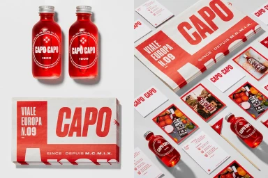
The brand identity for the Cappelletti family’s Capo aperitivo line serves as a masterclass in blending historic heritage with a sharp, contemporary visual language. This project, which spans a comprehensive range of collateral including packaging, promotional brochures, and marketing ephemera, leans into a bold, high-contrast palette of stark white and deep red to anchor the product in the competitive alcoholic beverages market. The design identity, orchestrated by the creative team at Concrete, utilizes clean typography and minimalist layouts to bridge the gap between artisanal Alpine roots and modern shelf appeal. By integrating archival-style landscape photography and vintage-inflected editorial aesthetics, the identity evokes the authentic, nostalgic essence of the Trentino-Alto Adige region. The visual execution relies heavily on commercial packshot precision and UI illustration, ensuring that the brand narrative—which traces the family’s production history back to 1909—remains consistent across diverse touchpoints. Whether through the cinematic, analogue-inspired imagery of Italian mountain villages or the clean, structured arrangement of recipe cards and stickers, the work establishes a cohesive aesthetic that feels both rooted in tradition and strikingly fresh. This identity effectively utilizes professional soft lighting and deliberate compositional balance to elevate the aperitivo, positioning the product not merely as a beverage but as a refined, design-led experience defined by its heritage and bold graphic character.
Horizontal, Commercial, Clean
Typography
White Seamless
Advertising Campaign
