
SŌM’s daily elixir shots: Brand Identity

Oct 2026
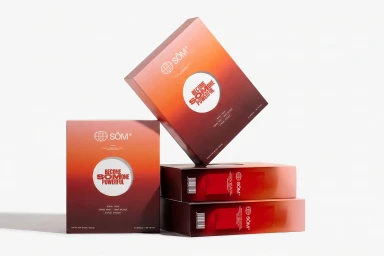
The brand identity for SŌM’s daily elixir shots centers on a refined, modular aesthetic across both packaging and digital collateral. Studio product photography emphasizes the drink's vibrant red-to-orange gradient packaging through clean, minimalist compositions. Dynamic shadows and deliberate spatial arrangements highlight the structural design elements of the box, including prominent circular cutouts. Contrasting the precision of the packaging, the brand’s visual assets incorporate an abstract, artistic approach. A series of long exposure motion-blurred portraits brings a sense of energy to the brand’s lifestyle imagery, pairing desaturated, overcast tones with stark, clean sans-serif typography. The design language for this food and beverage project was developed by .raw.
Minimalist
