
Be Disobedient: Brand Identity



May 2020
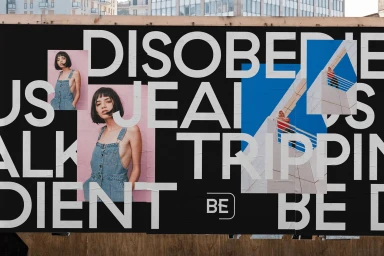
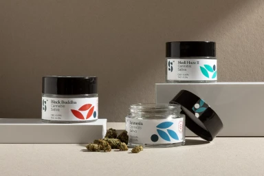
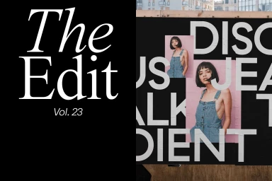
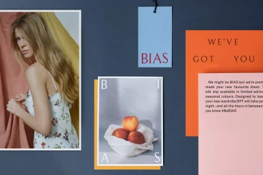
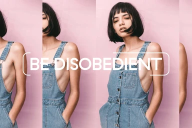
Be Disobedient serves as a masterclass in modern brand identity, where graphic design transcends simple labeling to become a rhythmic, visual language. Through a multifaceted portfolio of commercial work, the project showcases an editorial sensibility that effortlessly bridges the gap between high-fashion photography and structured, avant-garde typography. The execution leans into a collage technique, utilizing stark, high-contrast layouts and color-blocking to create a distinct, urban aesthetic that demands attention. From the tactile precision of embossed business cards featuring crisp, debossed lettering to the celestial-inspired packaging of the Elixr coffee line, the project emphasizes a rigorous attention to material texture and depth. By integrating architectural photography with raw, emotive portraiture, the composition establishes a cohesive brand narrative that feels both sophisticated and inherently rebellious. The studio product photography for cannabis packaging demonstrates a pivot toward clean, minimalist design, proving the versatility of the brand's core visual framework. Throughout the series, the interplay of bold sans-serif type and soft-light studio captures creates a dynamic tension, resulting in a refined visual hierarchy that remains consistent across posters, digital assets, and physical collateral. With strategic contributions from creative partners including butter creative studio, Smith & Diction, and It's Super, the work successfully navigates the complex space between commercial utility and artistic expression, establishing a bold, unmistakable footprint within the contemporary design landscape.
Horizontal, Commercial, Clean
Advertising Campaign


