
Sound of Sunrise: Brand Identity




Aug 2022
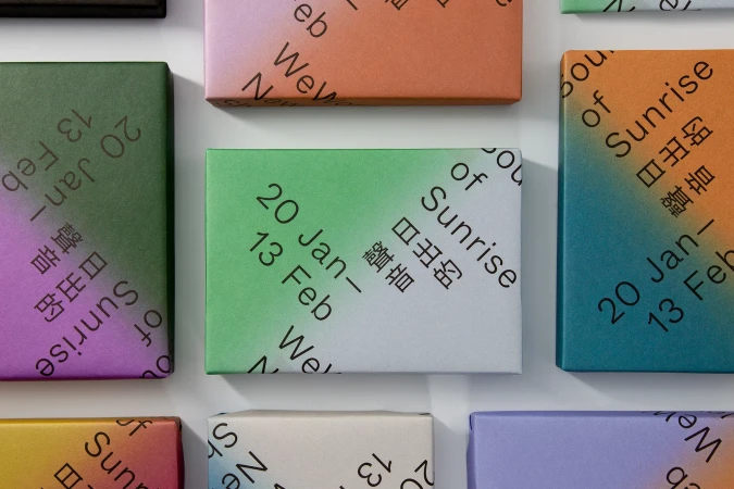
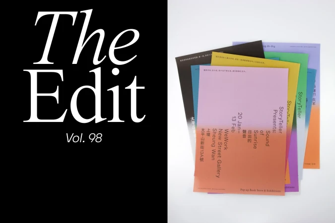
Sound of Sunrise presents a comprehensive brand identity project that bridges commercial design and editorial storytelling. The work centers on a clean, minimalist aesthetic, employing structured grid systems, bold typography, and a vibrant color palette of fluid gradients to unify physical and digital touchpoints. The project encompasses a wide range of collateral, from packaging design featuring repeating diagonal motifs to editorial layouts for sustainable architecture. Through a blend of graphic design, motion graphics, and paper art, the identity creates a cohesive visual rhythm that remains consistent across gallery installations, cafe signage, and printed promotional materials. Contributing creative partners include Third Paragraph, Ensemble, Peach Blossom, butter creative studio, and Studio Half Decent.
Horizontal, Clean, Commercial
Typography


